Create a series of between six and ten photographs on one of the following subjects:
• Things
• Views
• Heads
Preface
It might be worth looking at my previous blog post if you’ve not read it. In there I explain my issue in concentrating on one theme and how my original set of images did not match my definition of Collecting and that I’d somehow lost that key message. By re-reading the brief and examining the helpful resources I refocused and understood. Two examples stood out that really helped me with the idea of collection – 26 Gasoline Stations by Ed Ruscha (roo-shay – note for me!!) is the very definition of a collection, in this case he describes it ‘as cultural curiosities’ ((10) Ed Ruscha’s Photography Books | Artist Interview | TateShots – YouTube) but also says these pictures were taken without emotion. The second was Heads by Philip-Lorca diCorcia – this collection of 17 images all shot exactly the same way were selected from over 4000 (judging by the issues surrounding one of the images I bet he wished it was 16 for a while) my point is not to comment on how the influenced my own images as I don’t believe they have but on how I finally saw the concept as a ‘Collection’.
Assignment Rationale
I have chosen the theme of ‘Things’ for my collection but you could argue that they may also fit the theme of ‘Views’ and interpreted in a different way that may have been an alternative way of looking at them.
These images were something I had started to work on with the aim of using them perhaps later in the course but I realised that they actually fit the brief perfectly (at least for me) and so I completed one more photographic jaunt to get enough images that I could submit.
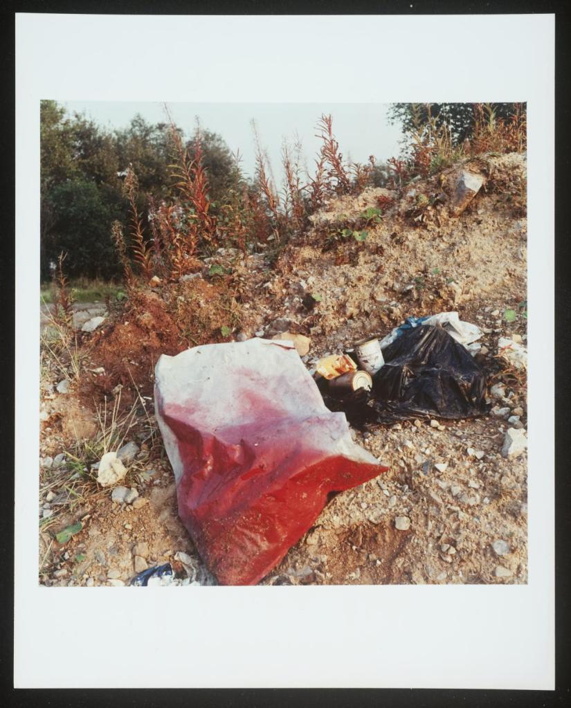
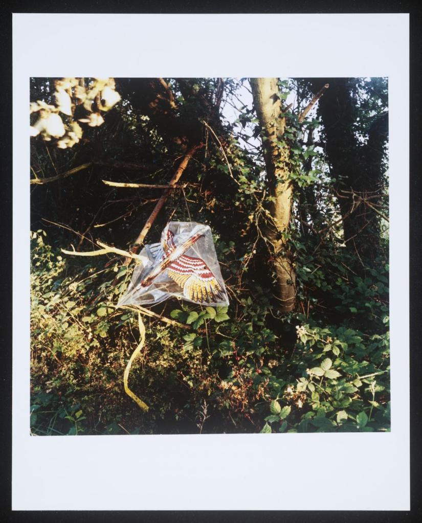
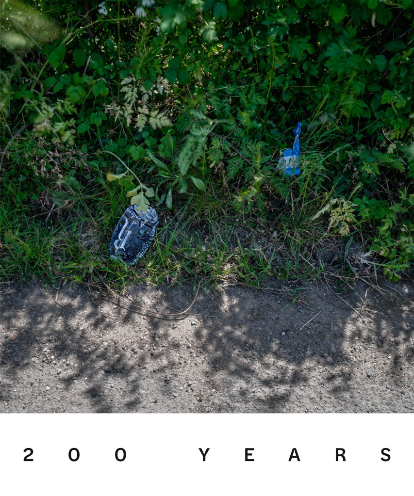
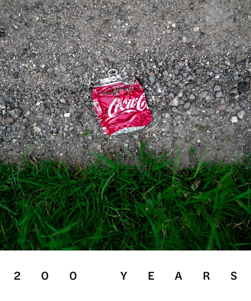
Lockdown has meant more people seem to be walking locally which is generally a great thing but one day I noticed a freshly tossed coke can in a ditch that just riled me. Why? Why would you just decide to toss it away in the open countryside? What pathetic justification did you come up with as you burped and threw it over your shoulder; if indeed anything? Who are you?! I then started wondering how long that can would take to rot if it just stayed in that ditch, I then started thing about other litter I see regularly thrown out of car windows and then further on from that what about the remains of other things that probably served a purpose at one time but have been left to rot once that purposefulness has passed. Either way it’s all the ignorance of man. Ignorance of action, ignorance of looking, ignorance of consequence.
I needed to photograph this. But how? The Keith Arnatt series that I partially reviewed in Assignment One were definitely an inspiration – turning discarded items into the focal point of an image were two themes he followed in the ‘Pictures From a Rubbish Tip’ and probably closer to my own interpretation was ‘Miss Grace’s Lane’. Both force the viewer to look at discarded items in different ways but Miss Graces Lane images are more straightforward and stark. By looking at them you may or may not feel a sense of culpability but you should feel the urge to do something about it – I want to reach into the images and clear up the mess. This is the same reaction I wanted to provoke.
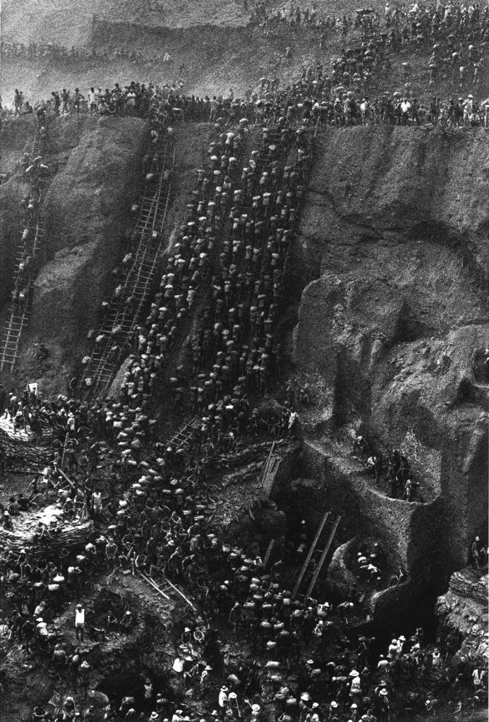
Sebastião Salgado’s images of the open gold mining in Brazil takes me aback by how easily we change our environment for short term gain and how these scars are often hidden from our day to day lives. No-one would begrudge these poor people a living but the merest hint of becoming rich has clearly driven these people to become a human embodiment of a marching nest of ants all working for a corporate queen.
There was one other photographers work that I’d like to highlight as an influence. Andy Hughes ‘Dominant Wave Theory’ series. These beach images of garbage are transformed into aesthetic sculptures or structures thanks to the close up almost macro camera work which are photographed against the beaches they were found on. Each image is beautifully composed but it’s the clever lighting that makes it. Whether it be a sunset caught through an upturned lighter or an empty sandwich carton in the darkness.
It’s a completely different approach to Keith Arnatt – less visceral, more composed but they still have the same message.

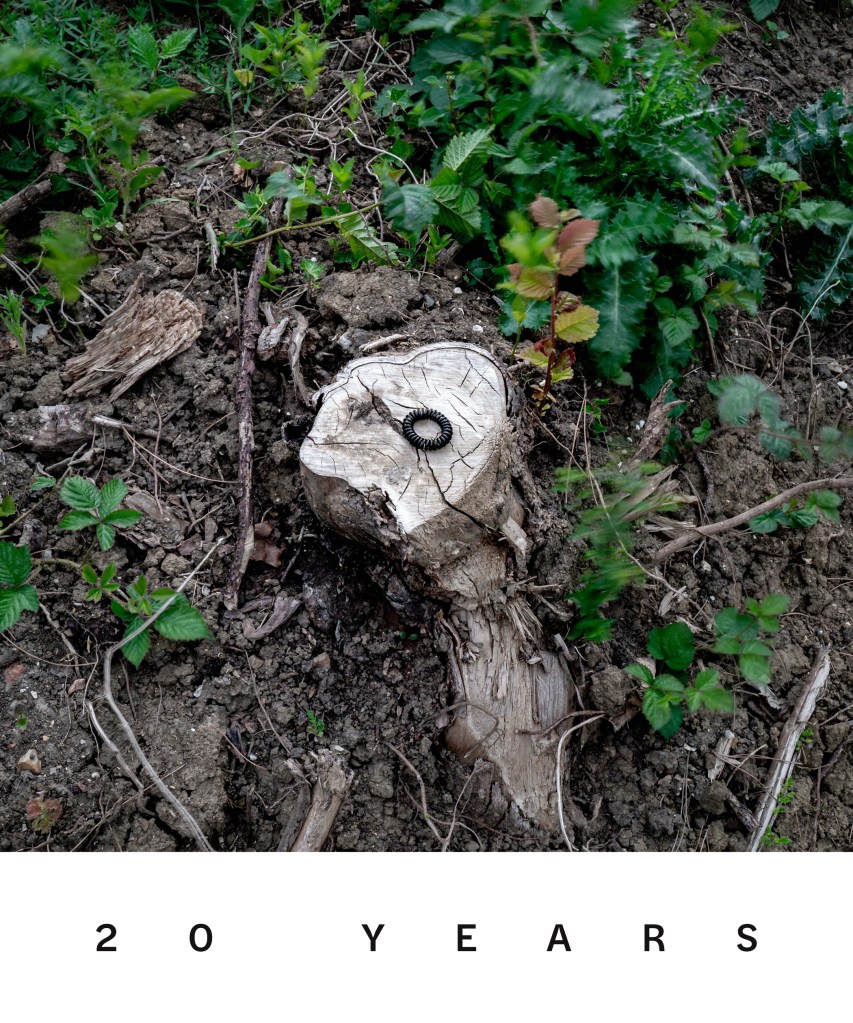
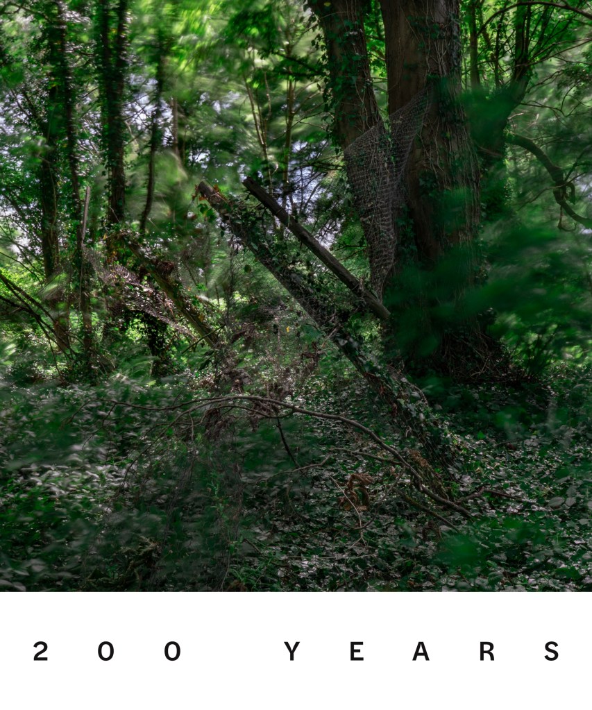
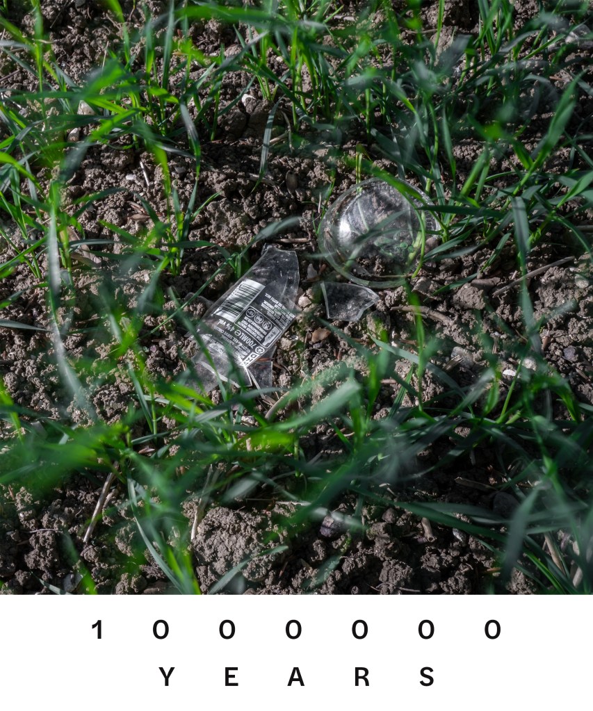
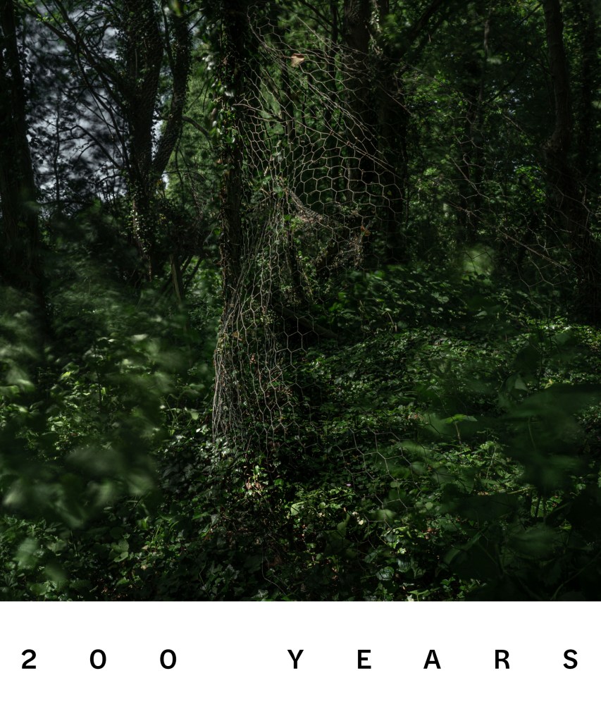
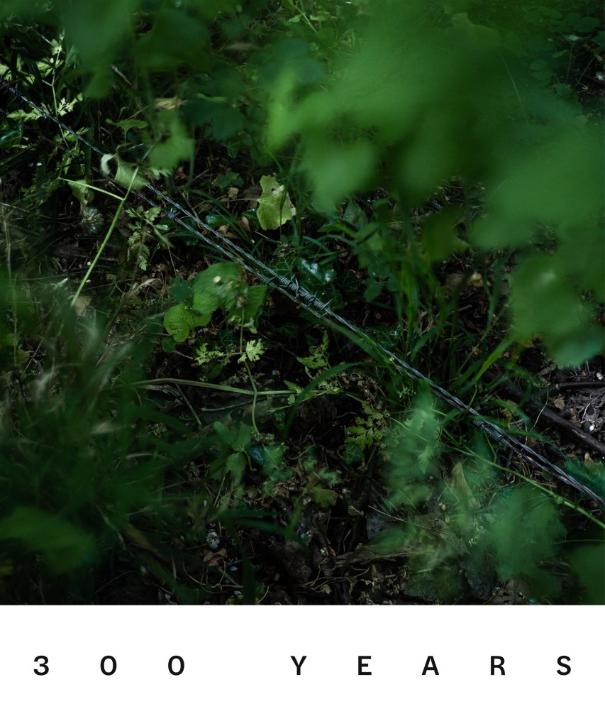
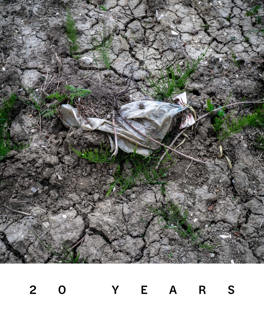
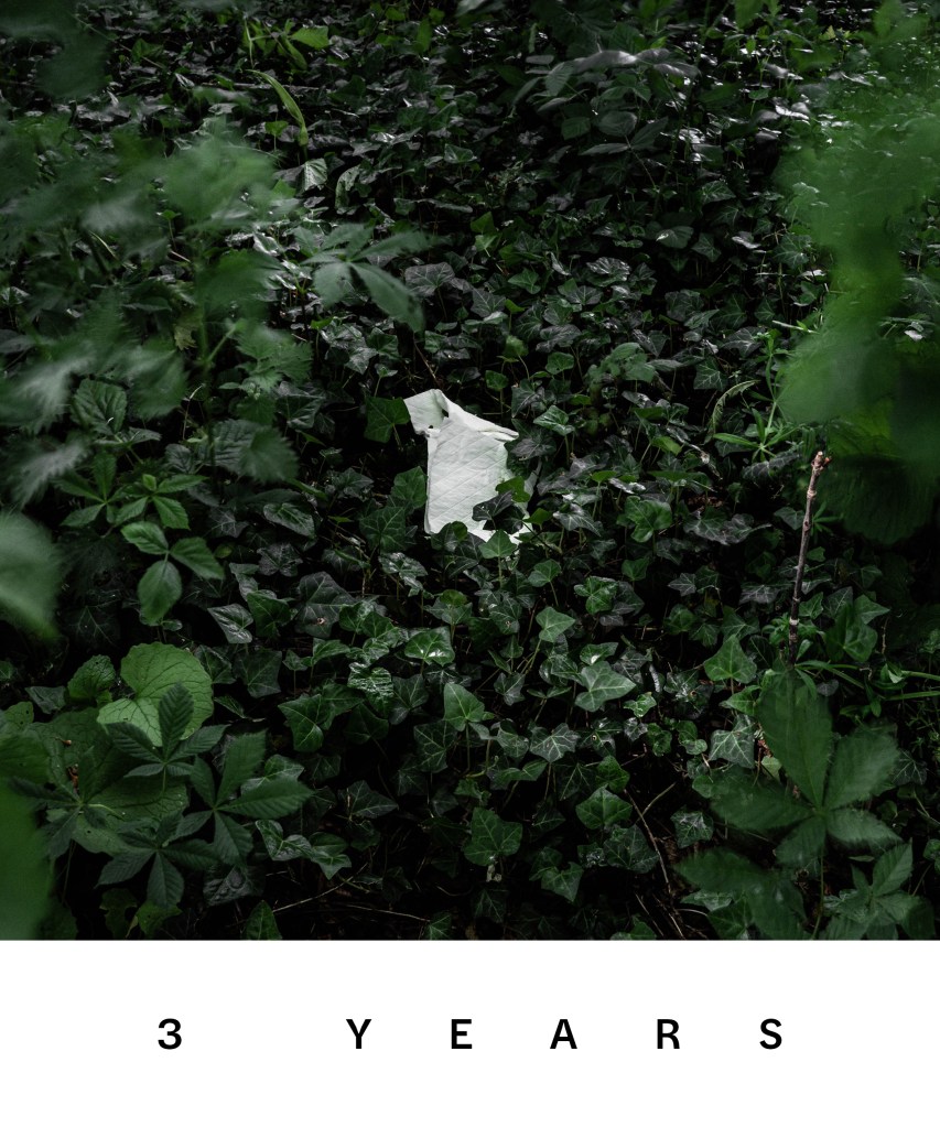
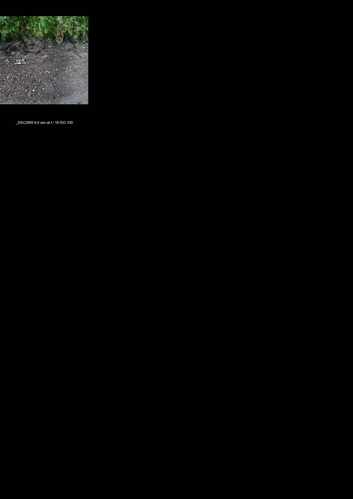
For this assignment my thoughts kept coming back to how long this discarded material will be left behind and when I investigated this shocked me. I’ve included the estimated number of years each item will take to rot as part of each title which to the best of my knowledge is accurate. I decided that I also wanted to show that whilst time is moving on this detritus will be still be here unless we do something about it. In order to achieve this I utilised a 10 stop ND filter to give me longer shutter speeds to introduce some blurring but also used a small f stop – f16 – to give me a larger depth of focus and longer shutter speeds. I have used different ISO’s starting at 100 and upto 1000 as sometimes correct exposure at a low ISO would have been ridiculously long shutter speeds – when in the woods for example. All images were taken using manual focus and focus peaking to ensure that most of the frame was in focus. I also used a remote shutter release with shutter speed being a mix of trial and error and again manual. The net effect of these longer shutter speeds is subtle in some images (perhaps just a blade of grass or two) and more obvious in others but I think it is an important part of the image even if it’s not always so visibly obvious.
In editing I have made minor changes ‘dodging and burning’ and slightly desaturated some colours apart from greens. All images were photographed with a square crop in mind with the subject at the centre or across the centre.
AMENDMENT: Following a feedback discussion with my tutor I have now altered the images below to include text as part of each photograph. I think they look the better for it though I considered alternative options that I may come back to in other work – I have created another blog post here regarding this. I have added a light grey background to the block so you can see how each image is now framed with the text as part of it.
The Assignment
The nine images are meant to be viewed individually but I felt the natural 3×3 grid also worked well within the confines of the website with the coke can in the middle centering the series.
Reflection
I think it could be fairly argued that the use of a filter to increase exposure time had limited success and perhaps was a laboured point and that a straight forward image could have just as easily delivered the message. I do however think that on the images where there is some more obvious visible movement they are better for it. I have perhaps moved my focus from one type of object (thrown away) to another (left to rot) during the assignment but I feel that really this is semantics – the actual problem is that these discarded objects should be removed / recycled or just thrown away properly and people should take accountability for their actions whether it was thrown without care from a car window or hammered into the ground for a good reason. I do intend to keep on with this series as I discover other abandoned or ruined objects and so it may end up being a continuous project.
UPD: Re-reviewing these in preparation for assessment I actually think I may be being a little hard on myself in my reflective comments! I think on the whole the movement whether it be slight or more obvious really helps the images to stand out. I would however change two things. I would swap out the second image – I think its the weakest of the nine and as there is already a can in the set another isn’t needed, a cigarette packet is missing – not only are you killing yourself but you also don’t give a fuck about the environment either – a much stronger message. Secondly I’d change the font size, it’s too big and clunky and although I wanted the message to be loud and clear I think the 1million years across two lines spoils the look a little.
Contacts
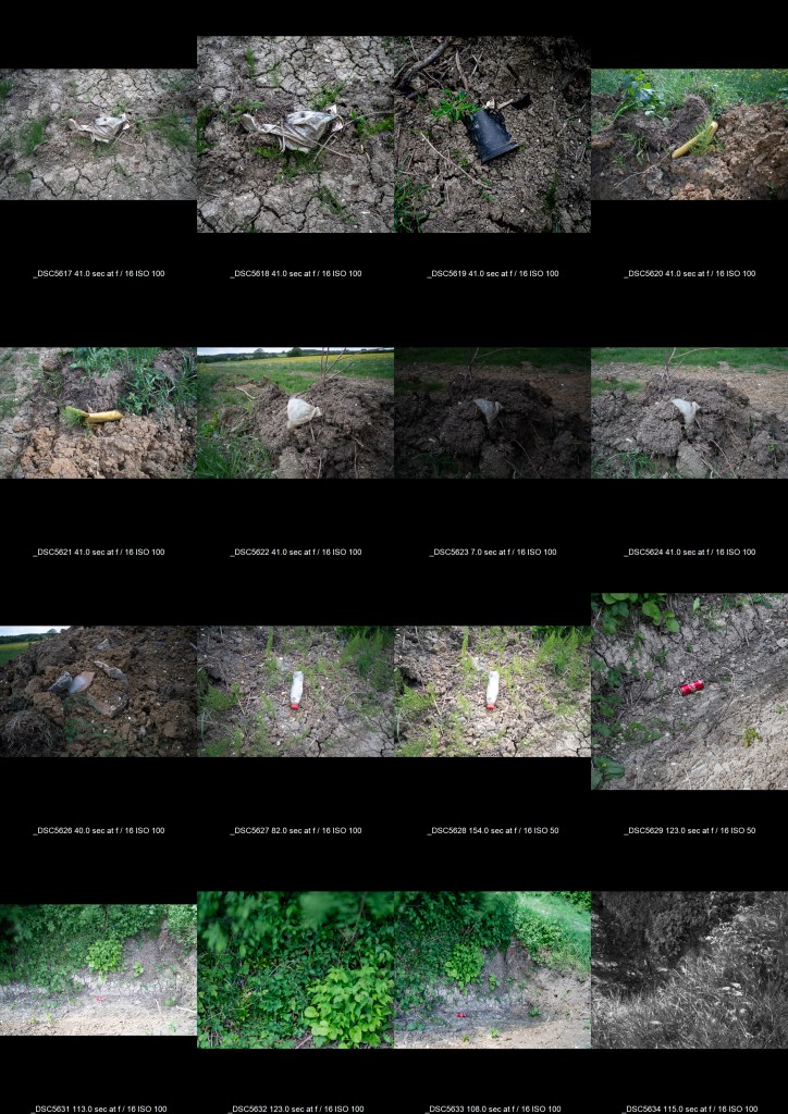
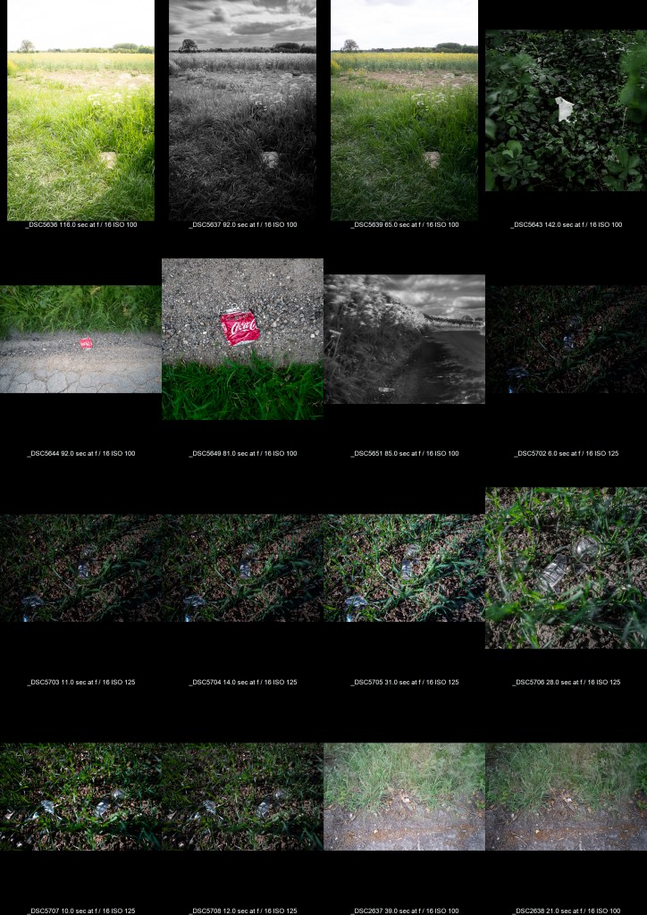
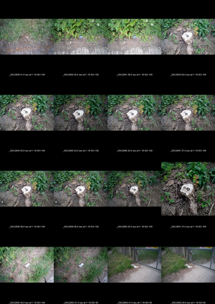
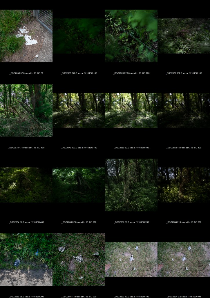
For info here are the contact sheets from the assignment. I have removed many rejected shots already from my lightroom database. Some images here are included that may be used as part of a later or re-worked project but they are close enough to this theme to include here.
Bibliography
(7) Presenting Hiroshima by Ishiuchi Miyako – YouTube (s.d.) At: https://www.youtube.com/watch?v=csVx_QRPvps (Accessed 13/05/2020).
(10) Ed Ruscha’s Photography Books | Artist Interview | TateShots – YouTube (s.d.) At: https://www.youtube.com/watch?v=0xboX5cvIzw (Accessed 26/05/2020).
(10) Keith Arnatt – YouTube (s.d.) At: https://www.youtube.com/watch?v=caOkTjYMDbQ (Accessed 26/05/2020).
(10) Philip-Lorca DiCorcia – Exposed at Tate Modern – YouTube (s.d.) At: https://www.youtube.com/watch?v=bpawWn1nXJo (Accessed 26/05/2020).
(10) Photography Secrets of Edward Weston’s Darkroom – YouTube (s.d.) At: https://www.youtube.com/watch?v=yT2-xpKBafs (Accessed 25/05/2020).
(10) Secrets of Edward Weston’s Photography – YouTube (s.d.) At: https://www.youtube.com/watch?v=bUAKoiRhLR8 (Accessed 25/05/2020).
Bazin, A. and Cardullo, B. (2011) André Bazin and Italian Neorealism. (s.l.): A&C Black. Bettina von Zwehl (s.d.) At: http://www.bettinavonzwehl.com/ (Accessed 13/05/2020).
how_long_does_it_take_garbage_to_decompose.pdf (s.d.) (s.l.). At: https://www.keepcasscountybeautiful.com/images/PDF/Recycling/how_long_does_it_take_garbage_to_decompose.pdf (Accessed 26/05/2020).
Keith Arnatt Estate (s.d.) At: http://www.keitharnatt.com/ (Accessed 26/05/2020).
Mårten Lange – Citizen (s.d.) At: https://martenlange.com/works/citizen/#1 (Accessed 13/05/2020).
Nussenzweig v. DiCorcia (2018) In: Wikipedia. At: https://en.wikipedia.org/w/index.php?title=Nussenzweig_v._DiCorcia&oldid=827626506 (Accessed 26/05/2020).
Species (1999-2002) (s.d.) At: http://www.andrewlangford.co.uk/projects/species/ (Accessed 13/05/2020).
Tate (s.d.) Albert Renger-Patzsch. At: https://www.tate.org.uk/whats-on/tate-modern/display/albert-renger-patzsch (Accessed 13/05/2020a).
Tate (s.d.) Ed Ruscha and the Art of the Everyday – Look Closer. At: https://www.tate.org.uk/art/artists/edward-ruscha-1882/ed-ruscha-and-art-everyday (Accessed 13/05/2020b).
Tate (s.d.) Edward Ruscha ‘Twentysix Gasoline Stations’ 1963. At: https://www.tate.org.uk/about-us/projects/transforming-artist-books/summaries/edward-ruscha-twentysix-gasoline-stations-1963 (Accessed 13/05/2020c).
Tate (s.d.) ‘Miss Grace’s Lane’, Keith Arnatt, 1986–7. At: https://www.tate.org.uk/art/artworks/arnatt-miss-graces-lane-t13164 (Accessed 26/05/2020d).
Tate (s.d.) ‘Pictures from a Rubbish Tip’, Keith Arnatt, 1988–9. At: https://www.tate.org.uk/art/artworks/arnatt-pictures-from-a-rubbish-tip-t13171 (Accessed 26/05/2020e).
The Genius of Photography (2007) Directed by BBC At: http://archive.org/details/tGoPhoto (Accessed 14/05/2020).
The World is Beautiful (s.d.) At: https://www.photopedagogy.com/the-world-is-beautiful.html (Accessed 13/05/2020).
Who is Ed Ruscha (And Why is he So Damn Cool?) (s.d.) At: https://www.youtube.com/watch?v=h_jwq9BLVW0 (Accessed 20/05/2020).
‘dominant wave theory’ by andy hughes (2008) At: https://www.designboom.com/art/dominant-wave-theory-by-andy-hughes/ (Accessed 02/06/2020).
Figure Eight, Serra Pelada, Brazil, 1986 (2018) At: https://thephotographersgallery.org.uk/print-sales/explore-artworks/figure-eight-serra-pelada-brazil-1986 (Accessed 05/06/2020).
Sebastião Salgado | Photographer’s Biography & Art Works | Huxley-Parlour Gallery (s.d.) At: https://huxleyparlour.com/artists/sebastiao-salgado/ (Accessed 01/06/2020).
Sebastião Salgado, Gold mine, Serra Pelada, Brazil [Figure Eight], 1986 (s.d.) At: https://www.peterfetterman.com/artists/171-sebastiao-salgado/works/37742-sebastiao-salgado-gold-mine-serra-pelada-brazil-figure-eight-1986/ (Accessed 05/06/2020).
dominantwavetheory (s.d.) At: https://www.andyhughes.net/dwt.html (Accessed 05/06/2020).

Much awaited. A great theme Lee, more so at a time like this. I relate to your anger on finding these especially when you expect that humans would have learned their lesson but apparently not. I think you have treated a cliched subject with great sensitivity and I like your treatment of every frame that you have made. I like the dark green tones of the frame that are consistent through the series giving it a sense of darkness, which gives this delicate subject even more meaning under the circumstances, imparting it a seriousness it much deserves. I like the point of view and especially the consistency of the series that you have cleverly woven together with the time that it will take to deteriorate. A well-done assignment, best wishes for the feedback.
LikeLiked by 1 person