Research for this assignment was a bit easier and less fraught with self questioning and doubt than Assignment 3. It was very early on after looking at Jean-Baptiste Huyn’s images that I knew I wanted to work on rocks for this assignment so with this already being decided the research I did was around things like colour theory and using flash rather than the work of many photographers. I also think the structure of part 4 of EYV really helped in the way it builds or suggests different avenues to explore with the section on creativity really expanding my thinking.
Jean-Baptiste Huynh’s work is mesmerising. His images around the colour black and the way he uses flash to give highlight and shadow is beautiful – it looks so simple but the execution is flawless (and anything but simple) – mental note to use one colour as a possible idea in Assignment 5.
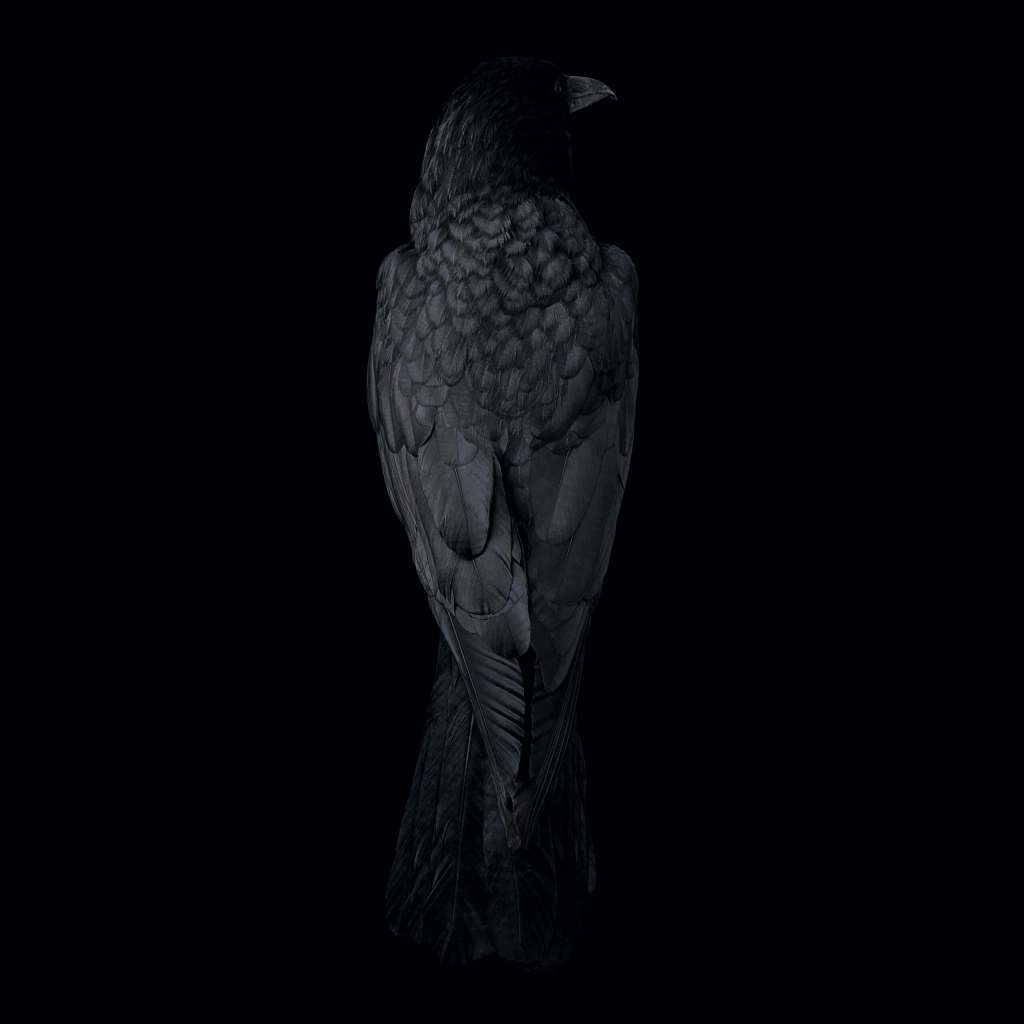
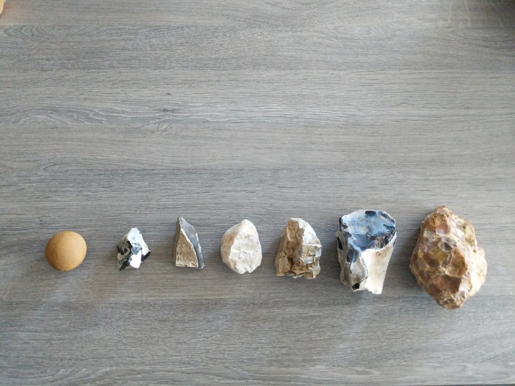
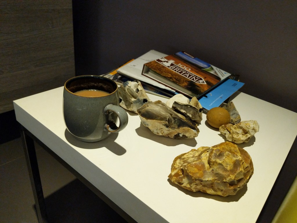
I first looked at his inanimate series of objects for inspiration and in an interview it was mentioned that one of ancient museum mirrors he had photographed was actually very small but they are displayed as huge prints – this helped me with regards my own shoots as I have conveyed different sized rocks as the same or similar sizes in the images. See below for a shot of all of the rocks I used plus one of Huynh’s ancient mirrors.
Idea
I wasn’t going to produce huge prints (I did print several A3 versions of one of the images but I struggled getting the colours to match – I intend to go back to this post assignment.) but I wanted the same feel in the images. It was important to demonstrate a decent control of light but also to highlight the textures and colours in the images. I had found the piece of flint I used on a walk with the intention of using it for egg or stone (in the end I used the stone on the far left) but the images I took with it seemed to give so much that I felt that this was actually the start of assignment 4. Ok so I had a start. I then thought – I know! Lets use the fossil’s and stones my daughter has collected – I went through the box thinking oh yeah this would work! I then grabbed a fabulous granite pebble with a coloured seam running right through it we’d picked up from a beach in south africa – I spent an hour shooting it and was very happy with some of the images BUT, BUT something wasn’t right. If my assignment was a mix of rocks and fossils from all over the world what does that say? Nothing. Time for a rethink.
I went out on another walk and as I was crossing a muddy field another piece of rock stood out – the orange one. I scraped the mud off and looked at the shape – wow this is actually pretty lovely to look at. Then it dawned on me that the series needs to be. Local geology. All the fields have been freshly ploughed for winter crops so that these buried rocks are now churned up and sitting on the surface. So after a few more walks I had selected local stones to make my images.
Colour
It was then I thought about colour. I could go for a black background in all the images but I knew that all that would do is mask any issues or mistakes with shadows and I didn’t think I would learn enough from using the flash sources.
I understood very little on colour theory but found a fantastic introduction to it on youtube from a fashion photographer that really helped me with backgrounds for the images.
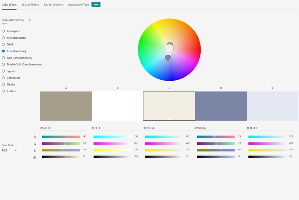
The adobe colour wheel site is also a useful tool to play around with combinations – especially as you can add the colour sample code from a selected area of an image and plug it into the colour wheel to find a triad, analogous or even a double split complementary (if that floats your boat).
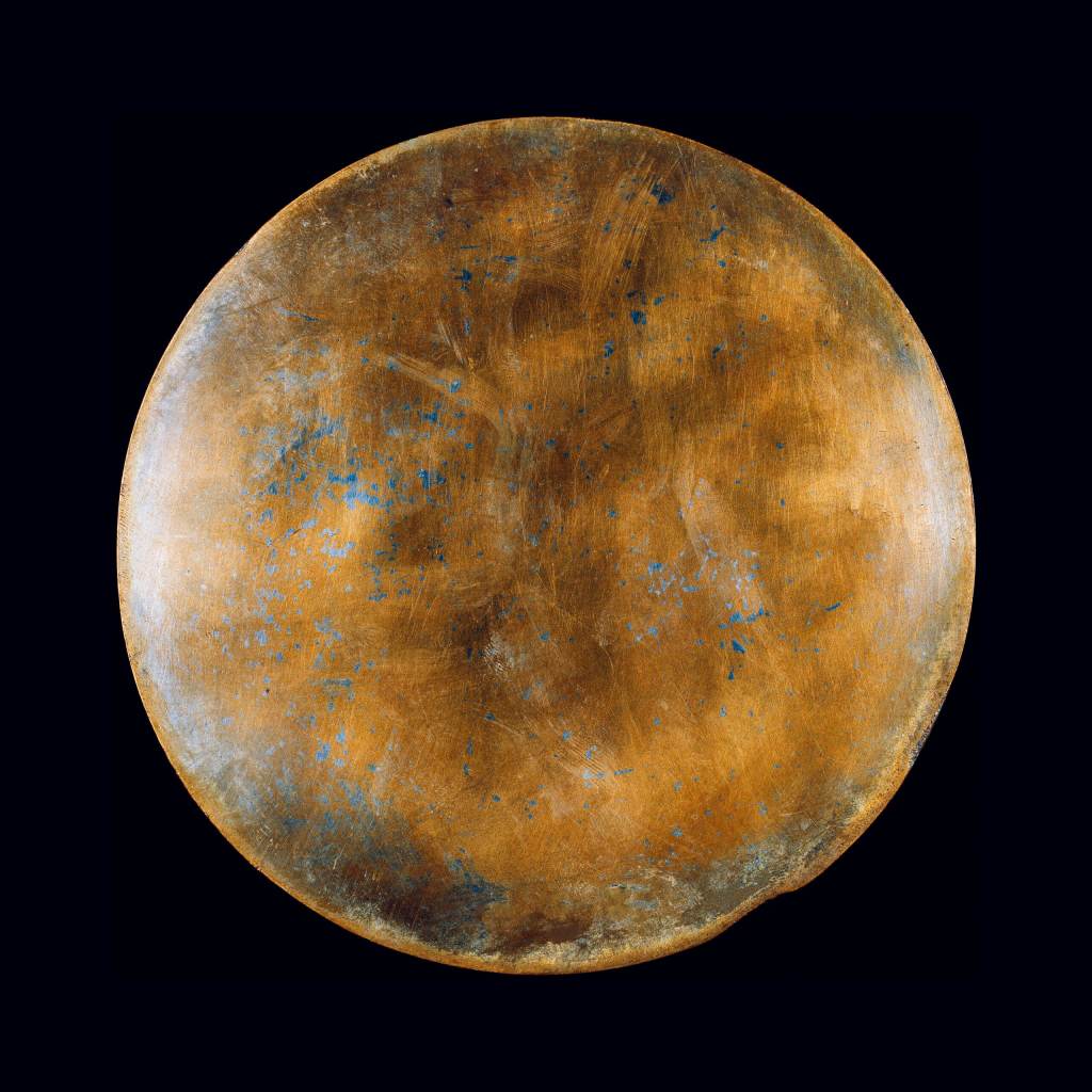
I stuck with the basics looking for complementary colours (on the opposite side of the spectrum) or analogous (colours based on the same hue as the starting colour) that I could use as a background. See example below for the chalk images where I used a colour close to ‘D’ for the background.
Lighting
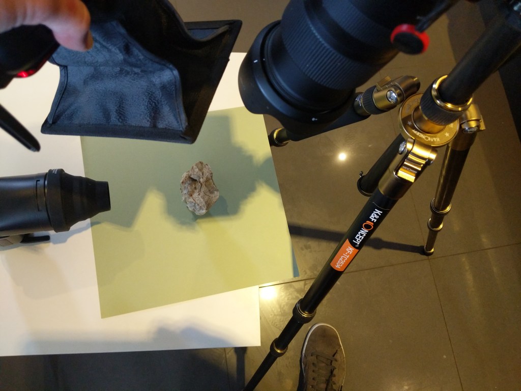
I have two flash strobes wirelessly controlled from the trigger on my camera. Depending on the effect i was after i would employ the use of a honeycomb grid, a snoot or a tiny softbox. From previous work in this part of the course I was beginning to understand what I could use to shape the light but I did find controlling the shadows to be complicated – this was in part due to needing to provide distance from the background to avoid texture showing behind the image (maybe I should have stuck with black after all) and therefore having to provide support to the rocks so that the were away from the background. I did also consider trying to build an infinity curve using the card but I didn’t have a piece big enough to work with and was conscious of time and so was forced to improvise…
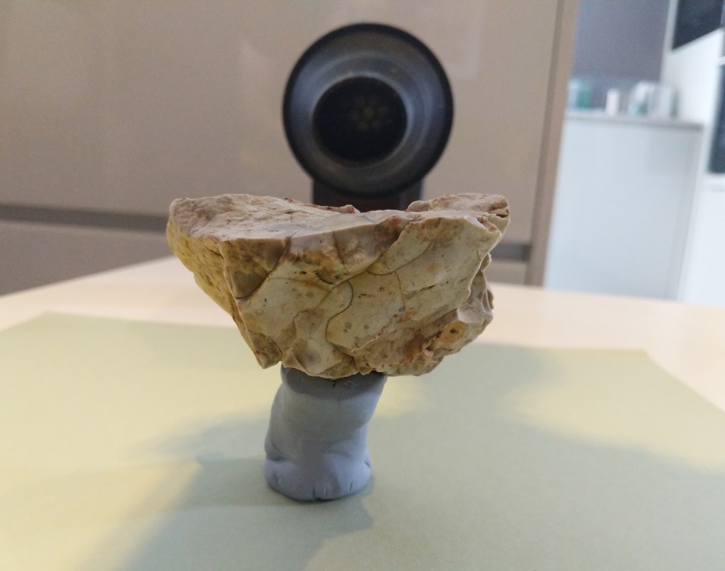
The support often added it’s own shadow and so I had to try and shoot at an angle where it either didn’t interfere too much or move the flash so the shadows were acceptable or less obvious. See below…
I very nearly bought another flash head but convinced myself to work around any issues I encountered. I do know that I need more kit to give myself more scope with flash photography and I’m sure a rethink on the lighting set up may have helped me here – I’m going to have to invest some time and money learning and experimenting.
You will see from the assignment that I haven’t stayed with one form of light – I think at this stage I should still be experimenting and so the lighting setup changes – I was trying to accentuate the textures and different shapes that these lighting setups give so for me it was an integral part of the work.
Execution
All images were taken on manual with a very narrow aperture of f22. I would normally never go near this but I discovered limitations I hadn’t considered before – with a macro lens a tiny depth of field is to be expected even at f22 but I was shooting from a couple of feet away – surely a rock would still be in total focus at f11 or 13?? Nope! If I moved further away the plane of focus becomes larger but then I am stuck with only a couple of million pixels of the subject so the detail I desire will be missing. Eventually I found a relatively happy medium in terms of getting the quality I wanted but at the expense of having to shoot at f22. There was also the issue of ensuring the backgrounds I used were not in focus. The black velvet material was nice and straightforward to use with low power flashes and minor adjustments in post but other backgrounds had a slight pattern or texture – even with isolating the subject away from the background a little these patterns were more evident than I had hoped and so all the lighter backgrounded images had to have a gaussian blur filter applied in post to remove that unwanted pattern / texture – If I could have isolated the subject further from the background this would have been an unnecessary step but may have then needed that extra flash unit I didn’t have to brighten the background.
I took over 700 images for this assignment – mainly because I was enjoying myself though occasionally because I came across technical issues with regards support for the stones (even using a pile of coins at one point) or just being unable to get the lighting correct.
Selection Process and Presentation
I found the selection process easier than I thought considering the number of images taken. I did chop and change a few along the way but as many were experimental I could hack out 30 or so at a time which made the narrowing down process quick. The only images I struggled with where the chalk ones. I think it was because they have a completely different look to them they stand out but I was comfortable including them as they are part of the local geology.
I also had it in my head that some of the images would look better presented together – the four flint images and the triptych of the other rock were seen quite early on – but how? I couldn’t see how they would fit a wordpress gallery without losing impact. I thought maybe a slideshow but that looks dull without the thought process behind the images (to me – I’m invested in this!). I had toyed with the idea of putting images into a book, it seemed that they would better fit presented in that way but when I put a draft version together it still seemed to be missing something. I then realised it was some text – I needed to express the experience of this assignment and the connection (like Haas’ apple) I had felt. Explaining it wouldn’t work, so how about a poem?! Ok give it a go and see what comes out. Hmmm – had to chuck some gas on the almost vanished pilot light on that part of my brain but I have to say I thoroughly enjoyed doing it. Formatting the book was done in lightroom book module and what a pain that was – It’s the reason there are two blank pages in the Assignment – I couldn’t take them out without the formatting going wrong and the double page spread being cut. I did download Bookwright which was a joy to use but when saved as a PDF it put watermarks on the pages. I’ll have to spend some more time with other software to see how I can get future works to display better.
I hope this conveys at least why I still struggle a couple of weeks after taking the images to throw the bloody rocks back in the field…..
Bibliography
AQCOLOR by BenQ Europe (2020) Joanna Kustra on the secrets of colour grading and how to achieve an individual style in photography. At: https://www.youtube.com/watch?v=RfQX4w711MI (Accessed 19/11/2020).
Karl Taylor (2020) 6 LIGHTING FACTS All Photographers Should Understand – Studio Lighting Tutorial. At: https://www.youtube.com/watch?v=bRmxKAz3nc0 (Accessed 19/11/2020).
Sean Tucker (2020) Controlling Colour in your Photography (Hue, Saturation and Luminance). At: https://www.youtube.com/watch?v=09CAkP6LJbw (Accessed 19/11/2020).
Jean Baptiste Huynh (s.d.) At: https://www.jeanbaptistehuynh.com/en/ (Accessed 13/10/2020).
USC Brain and Creativity Institute (2014) Jean Baptiste Huynh in Conversation with LACMA’S Britt Salvesen and Antonio Damasio. At: https://www.youtube.com/watch?v=7moX3TCGoSc (Accessed 13/10/2020).
Geology and Earth Science News, Articles, Photos, Maps and More (s.d.) At: https://geology.com/ (Accessed 19/11/2020).
Wikipedia contributors (2020) Flint. At: https://en.wikipedia.org/w/index.php?title=Flint&oldid=987878665 (Accessed 19/11/2020).

Brilliant work Lee! First of all, I love the images, especially the texture you have brought out in the individual stones. I also love the different coloured backgrounds that set the stones off beautifully. I think it’s a great idea to present these images in book / pamphlet form. I have used Bob Books on a number of occasions to produce a hardback album – expensive, but well worth it for the quality. I found it quite easy and intuitive to use too.
I’m glad I’m not alone in struggling with studio lighting and getting the correct depth of field. I spent days and days on the egg / stone exercise – and I’m still not happy with the result! Like you though, I found a small aperture gives the best result.
I was fortunate to see an exhibition of Huynh’s work last time I was in Paris – it was breathtakingly beautiful. Naturally, I bought the book – Infinitis D’Asie.
Good luck with your assignment! Kathy Roddy
LikeLike
Cheers Kathy, really appreciate it. Jealous of you seeing his exhibition! Can’t wait to start visiting galleries again! Were they giant prints you saw?
LikeLike
Yes, huge! Utterly magnificent!
I was just talking to my husband this morning about how much we miss visiting exhibitions. We used to go up to London at least twice a month and Paris a couple of times a year. Can’t wait to do that again!
LikeLike