UPDATE: Although I will leave the original photo’s as they are I can not seem to shake the fact that I ballsed this up somewhat. So, in order to cleanse my soul of 1.2 I have now included a set of pictures which fulfil the idea correctly. I have added them to the bottom of this post!
The initial excitement of starting the course just after xmas led to me getting the first Assignment out pretty quickly. I then realised that I hadn’t been doing much research so far and so have taken a week or two to look at other peoples blogs and photographers work using the EYV quotes and suggestions as my starting point but often ending up somewhere else completely – but usually enjoyably with relevance.
It was interesting to read on at least two other peoples blogs that they felt they had either over laboured this exercise or generally spent too long on it (damn didn’t reference them!). I found myself in the same situation from a starting position of ‘oh this is straight forward’. It is and it isn’t. Something as simple as ‘the point’ in an image for the purposes of this exercise had become suddenly complicated when I kept thinking about what I would photograph and why it would be a good subject to illustrate. I think the fact that the ‘point’ should be small and not obvious became lost on me against where it should be placed in the frame and so after I took the images below I then realised that my ‘point’ is certainly not small though it takes up only a small percentage of the frame but it probably is obvious.
The perspective I have chosen meant that the auto setting on the camera have produced a flat image as the elements are all on the same focal plane. The example image in the EYV book has strong foreground blur which helps to lead your eye to the back of the image.
I wanted the entire image to be in focus and not give the viewer a visual clue. I have also converted the images to black and white so that colour does not play an obvious part in leading the viewer to the ‘point’. These are not cropped and the only other editing was to straighten them slightly horizontally.
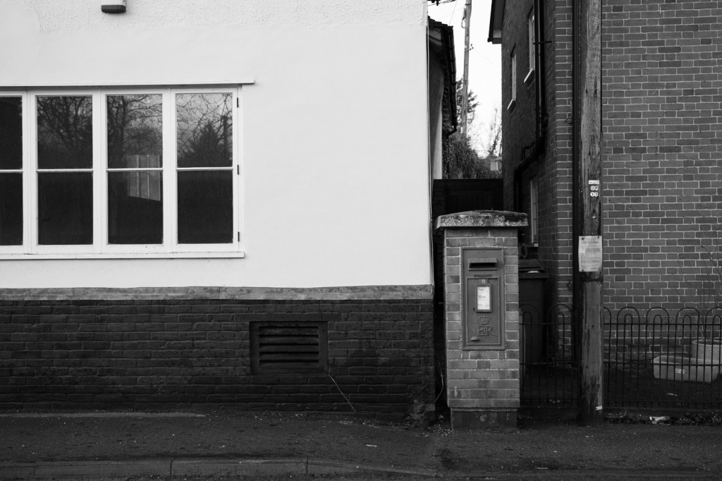
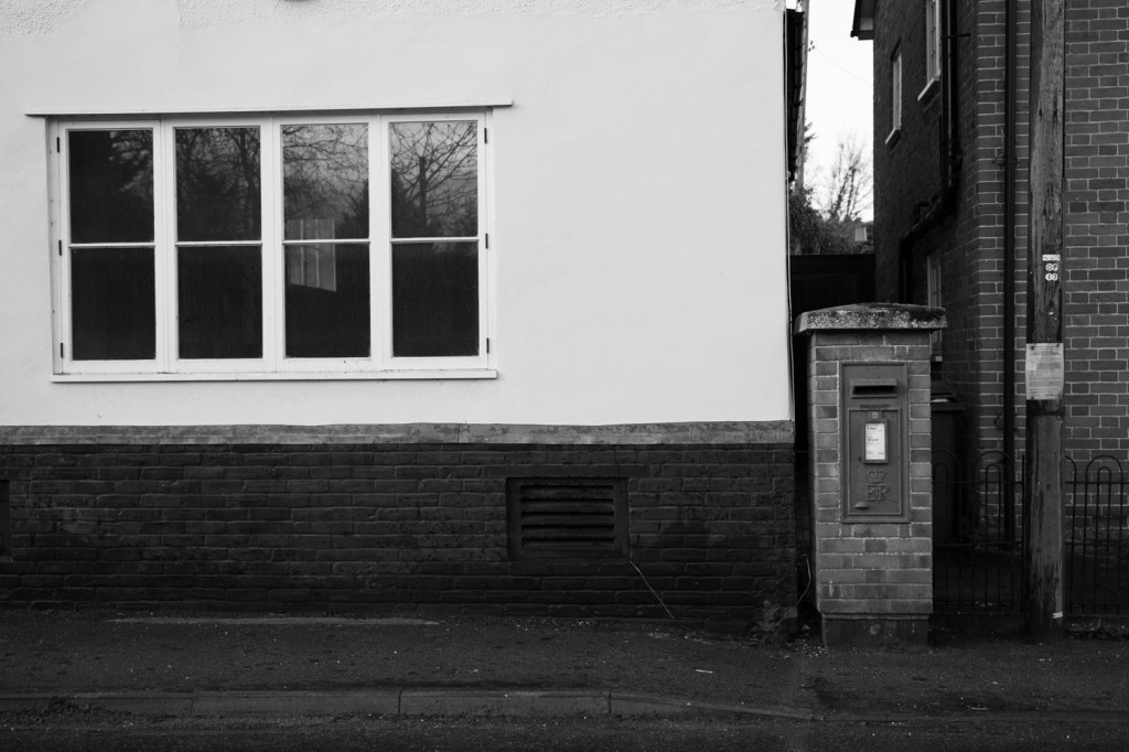
This image roughly follows the rule of thirds but there is a slight conflict as to whether the post box or the pole are the subject and the notice on the pole jockeys for prominence with the collection times on the post box. The window though not the ‘point’ is also cropped which along with another cut off element above the window has a jarring effect.
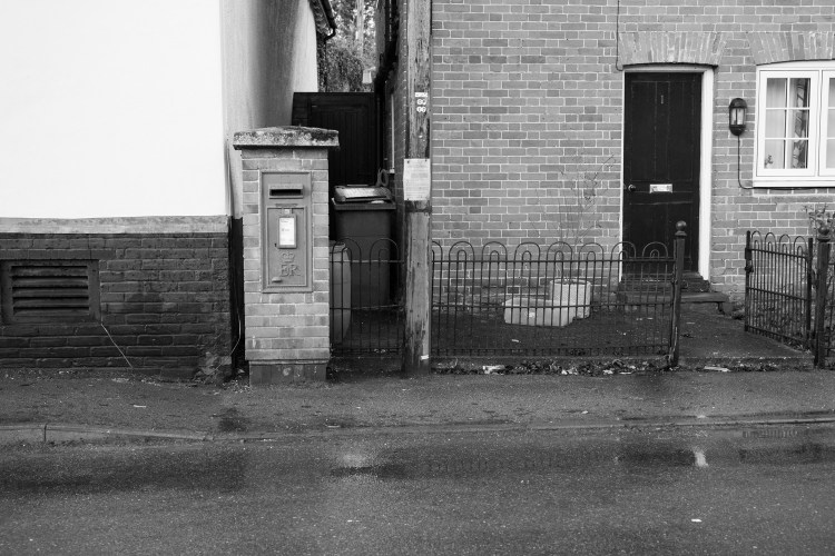
Moving the ‘point’ to the left of centre introduces many other elements into the picture most of which fight for attention. What am I supposed to be looking at ?? The door? The post in the middle? The open gate? Even though auto settings have exposed the post box to be brighter (probably in an attempt to correctly expose the black door) it doesn’t mean you want to look at it. It looks and feels messy (though I have made an error by not moving a step to the right to ensure the lines remain parallel).
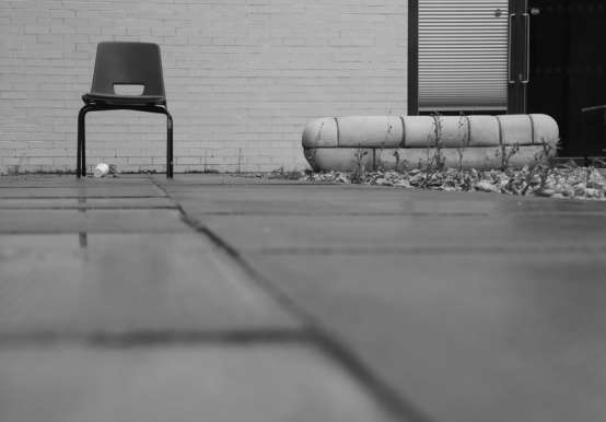
From memory Making the ‘point’ central was not quite the idea of the lesson as it does not make use of the rule of thirds but in this instance despite some of the other clutter trying to subtract from the image it actually works ok. I think this is due to my choice of point being perhaps a bit too obvious and familiar so you are drawn to it naturally.
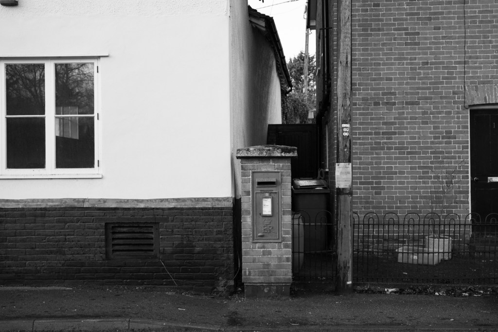
Although this is similar to the first image I wanted to include it because it demonstrates how framing the image a fraction differently can result in something much more cohesive. Now the ‘point’ should be blindingly clear but the framing works so much better even though the pole is still present. The window, now complete, adds balance and the horizontal and vertical lines add a pleasing geometry. Auto exposure also seems to have worked a good balance between the light and dark areas of the image.
I did photograph a couple of other subjects for this lesson which I will include here for completeness with less commentary.
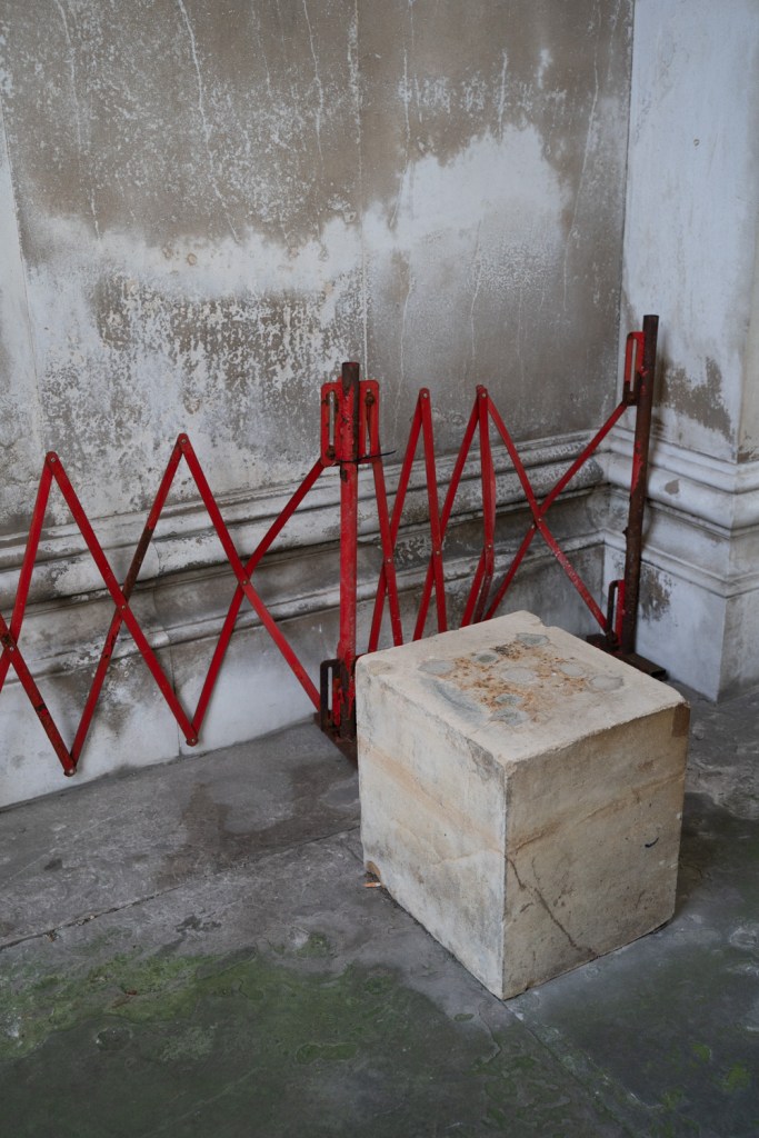
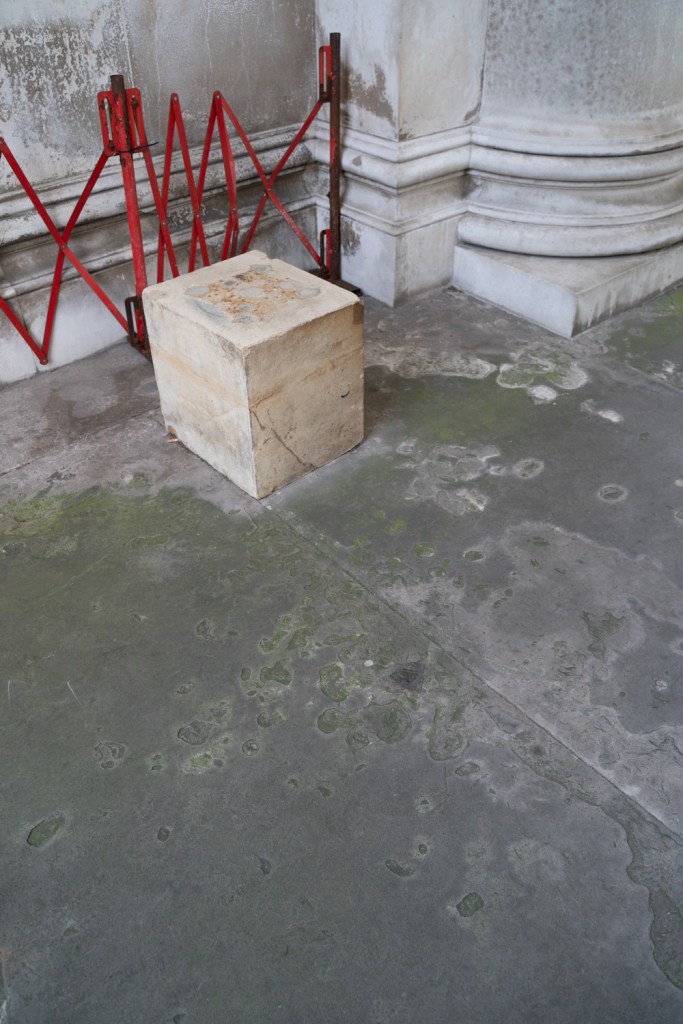
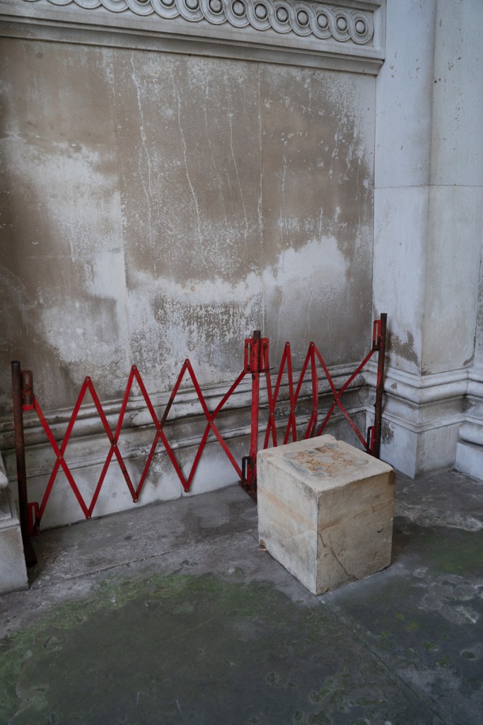
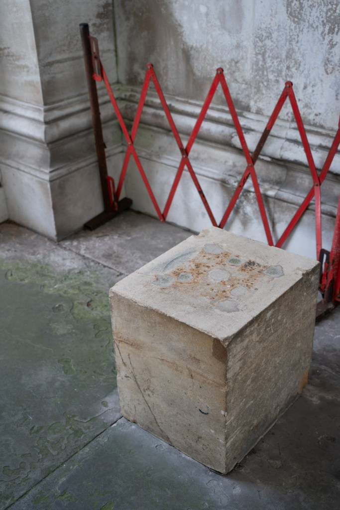
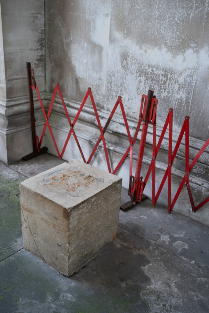
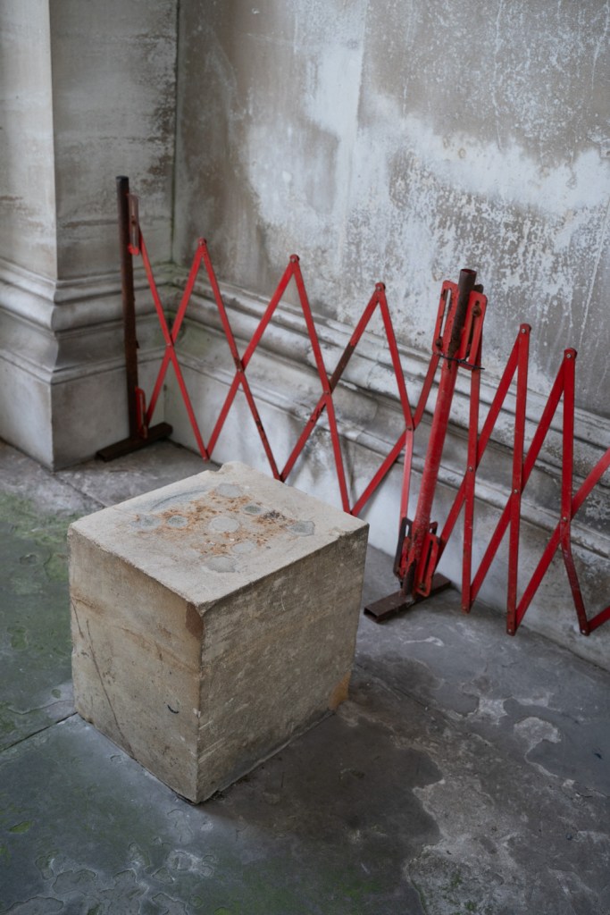
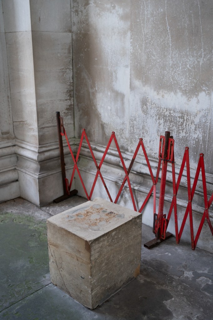
These 7 images are taken from two different angles and made use of a zoom lens. I liked them for their geometry colour and texture and have a painterly quality about them. For me the slightly abstract nature of them meant I found it hard to look at them in the same way as a photograph of an object in a traditional environment so I found it harder to see what works best as an image as most work when viewed on there own apart from the fourth image as the cube is far too prominent. In retrospect I should have shot another with the cube dead centre as I think it would have been clear that this would look odd leaving the viewer no where else to look.
It is also and critically clear that the ‘point’ in those images is a subject of its own not a point and so these were rejected.
I think these images have more potential in the line exercise so will revisit them.
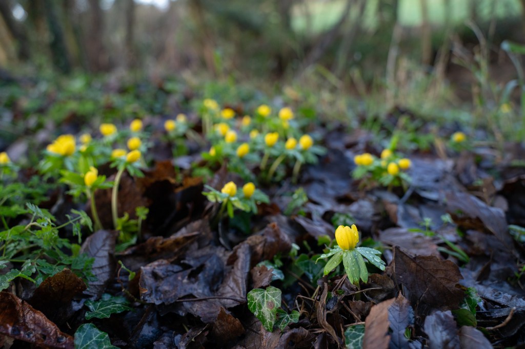
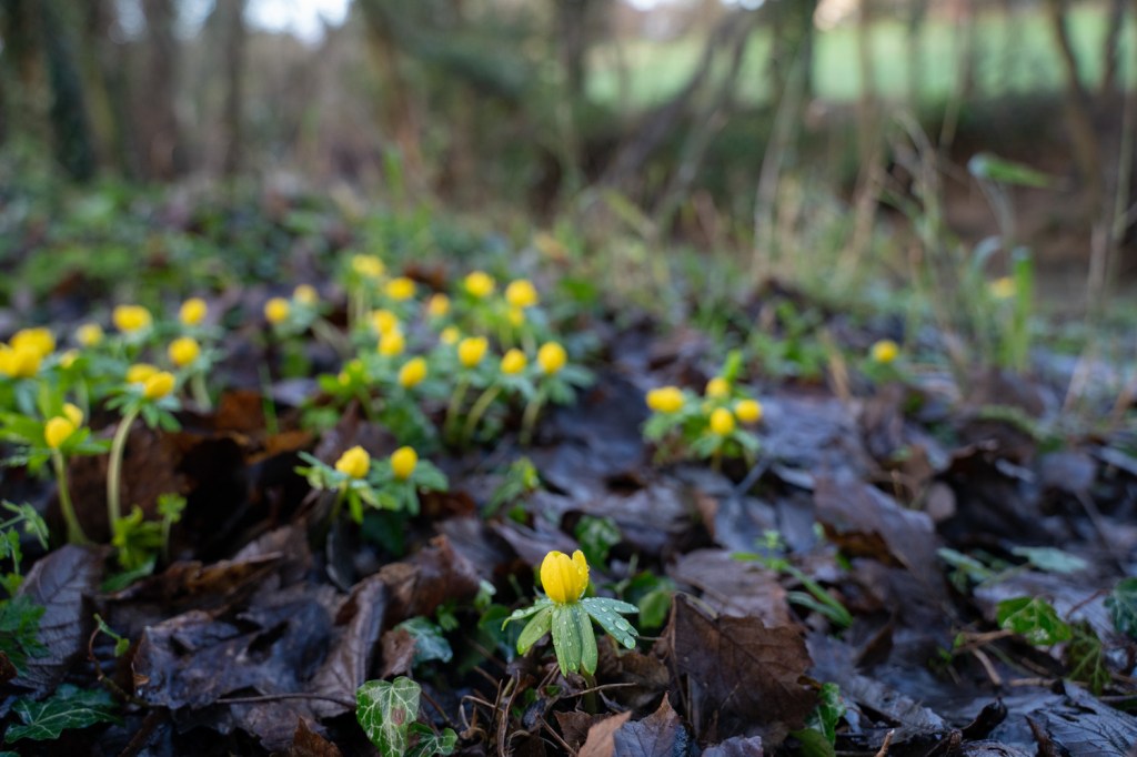
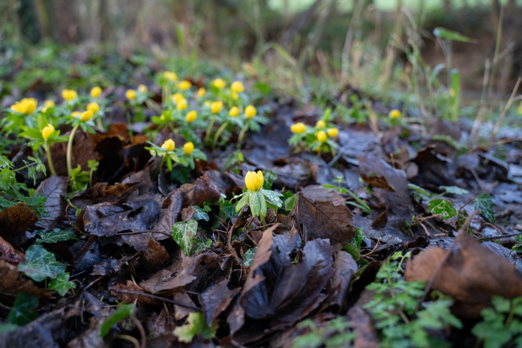
‘Auto’ was a struggle for these three images as depth of field was beyond my control and a combination of a 2.8 lens and a semi macro shot meant I quickly gave up on this experiment as the camera couldn’t make it’s mind up what it wanted to focus on.
However from these three shots it is clear that the first is the only one that even begins to work as an image – it follows the rules of thirds and leads the eye into the image to the patch of flowers beyond. The other two images clearly don’t follow the rule of thirds and they demonstrate nicely why it’s so important to know the rules before you look to break them! The aconite in the bottom middle leaves too much space to the right and cuts off the the flowers behind it – it leaves the viewer nowhere else to go and is boring. The third image is even worse with the point central there is even more wasteland for the eyes.
Retrospect
I’ve known about the rule of thirds for many years and have followed it as a guide (including always having the grid lines on my viewfinder for the last ten years) BUT in reviewing this exercise it became clear that my thought process when taking an image may be roughly following rules but it seldom makes me consider if there are better alternatives. Why should I focus on that side of the image? What if I moved the point to the lower left? Try it. What does it look like? Where do I want the viewer to look? Should they follow the point into the image or away from it?
I’m sure this process will feed into my composition work in the next few lessons.
Update
I shot this next image on a walk around Cambridge recently shooting images for 1.2 Lines. This would have been a far far better image for this lesson.
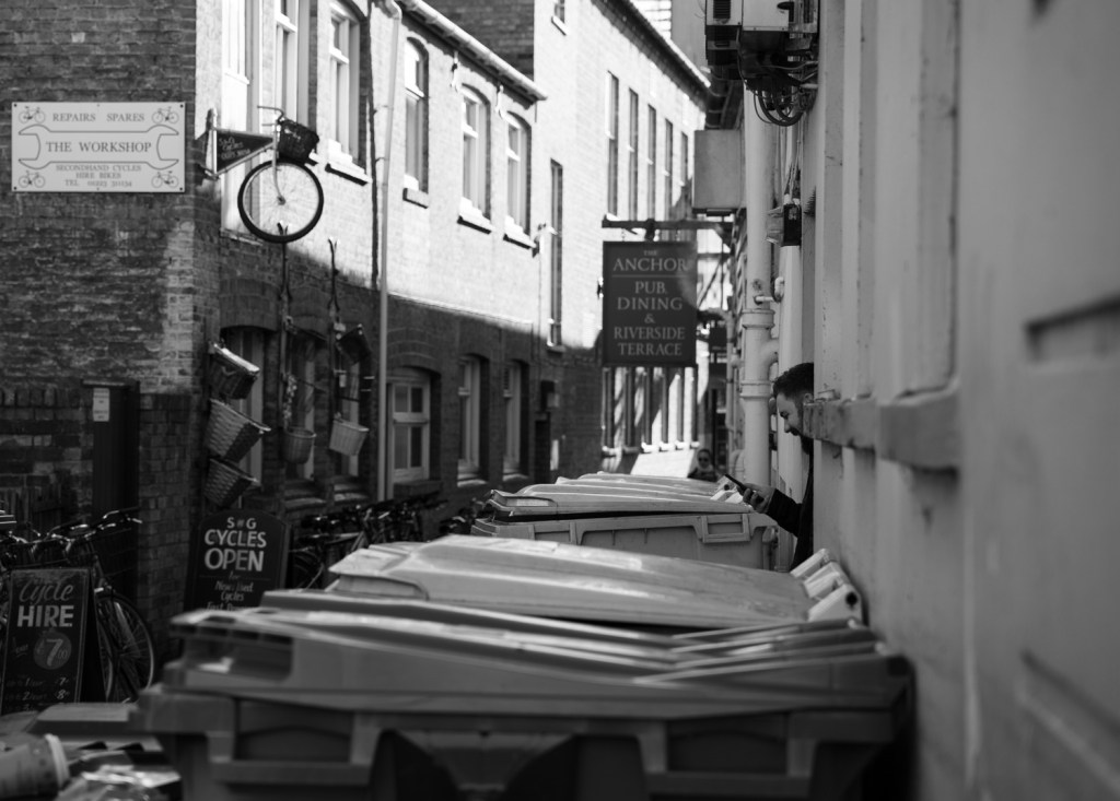
It was taken quickly as I didn’t want him to notice me. If I’d have thought for a second I could have quickly positioned the guys face at different places in the frame which would have taken away the visual cues of the bins and the window sills on the right hand side which lead you to the guy on his phone in this image. Hey ho – next time.
UPDATE: I found the point!!
So here at last and finally are a set of images that fulfill the criteria.
1 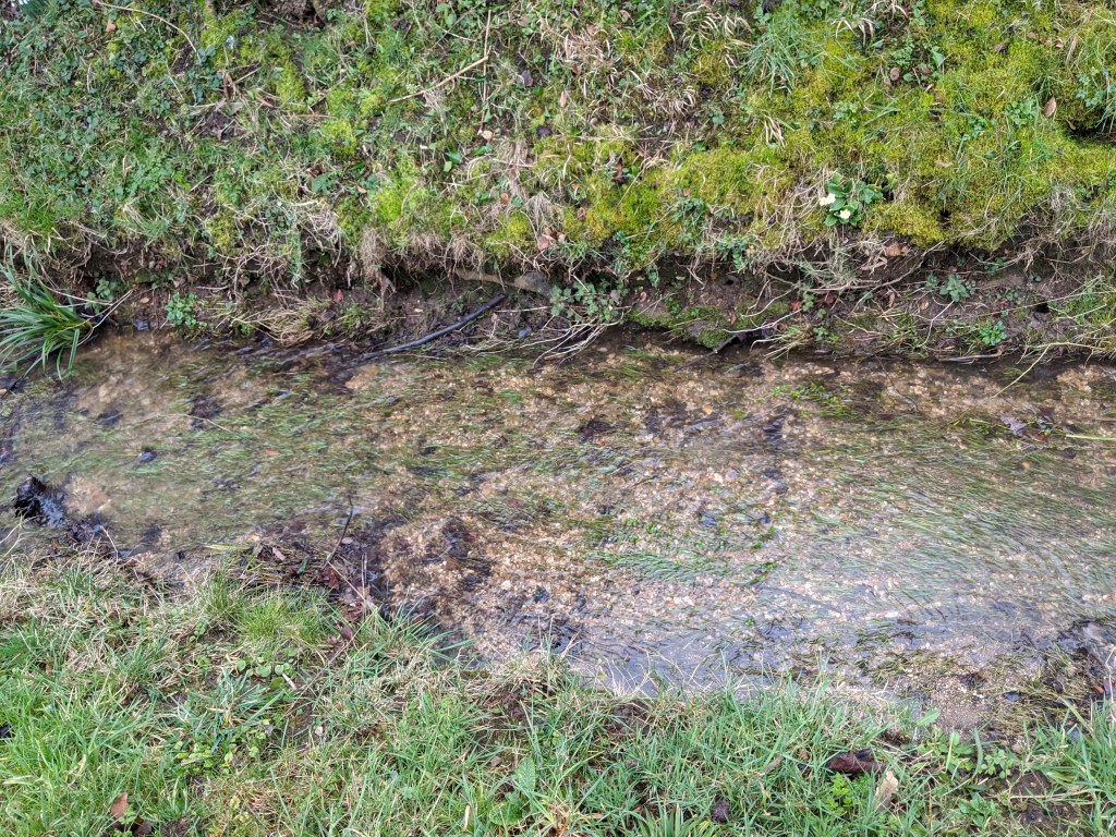
2 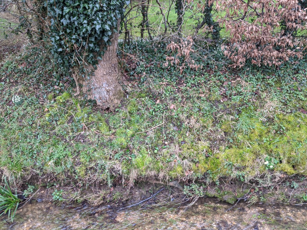
3 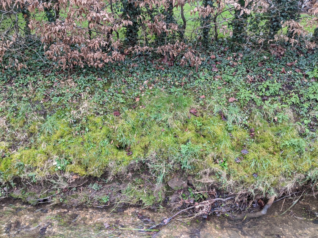
4 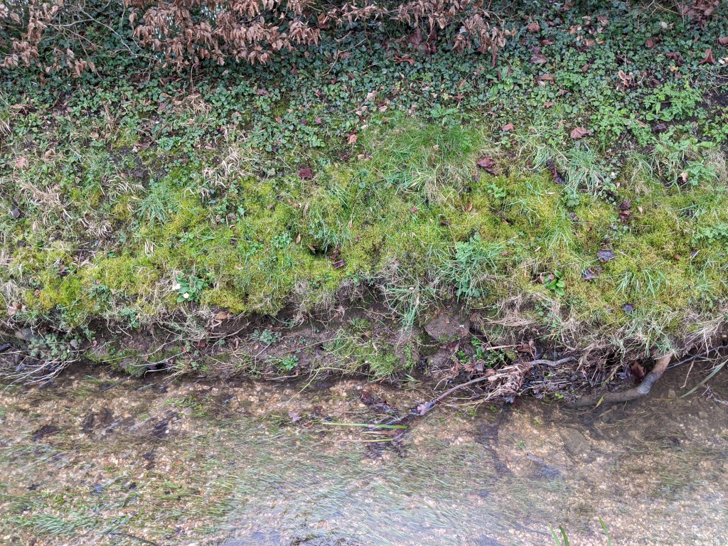
5 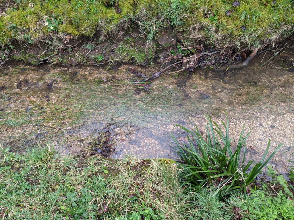
6 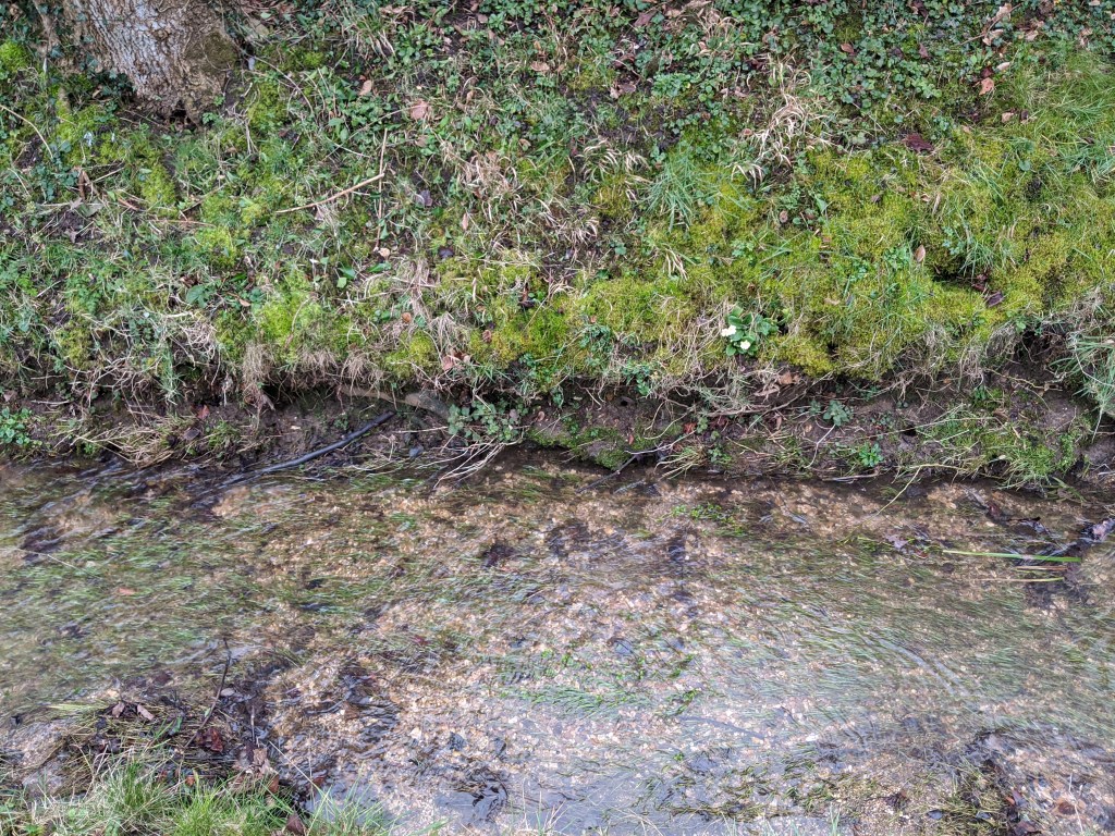
7 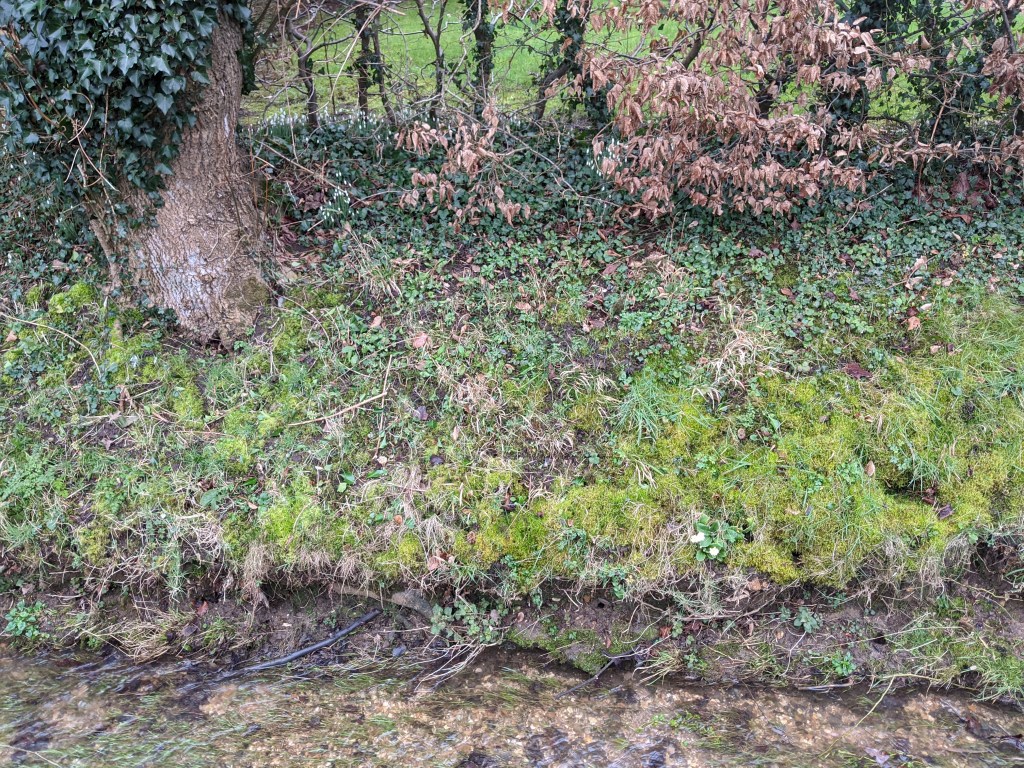
8 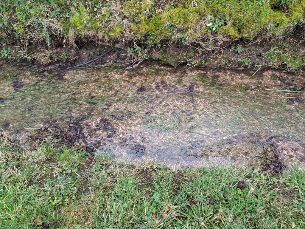
9
Clarity of thought, simplification and always having something to take an image with in your pocket or around your neck!
I knew my images at the top didn’t fully fit the brief and made mention of it in the blog. It was gnawing at me everytime I went for a walk and then following January’s EYV meetup it and discussion of this very subject I knew I had to add a different set of images.
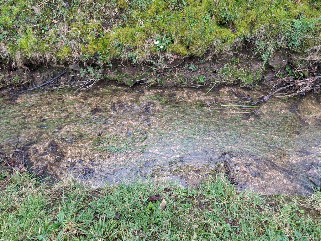
All the above images were taken on my phone this morning. I have been looking for a single flower to use as the point and this winter primrose worked beautifully as it’s on a bank by a stream below me with enough definition contrast around it to stand out but also busy enough that it shouldn’t be immediately obvious on a single image BUT obvious when viewed as a whole . I have had to take a step or two left / right depending on where I wanted the point to be and this alters the composition considerably.
I prefer 1, 2, 7, 6, 9 in that order and the others as they are cleaner compositions. 2 is an obvious candidate due to the cleaner lines and the use of thirds but I like where the point is in 1 the flower almost dots an ‘i’ as there is a vertical line caused by the gap in the stream weed that leads to the flower. 7 divides the image in two and the point though not strictly thirds offers perhaps a more obvious subject which I like.
Reflection
This has been literally an eye opener. Something so simple has had me pouring over images and challenged me to think differently and then rethink those images and finally to rework it completely.
I need to ensure that for future tasks I have a greater understanding of the essentials of what is needed before shooting. I intend to do this by writing a brief summary of the requirements of the lesson on the blogs each time and when I am happy with that then I’ll shoot.
