Brief
Take a series of images using lines to create a sense of depth…..Now take a number of shots using lines to flatten the pictorial space.
Note: This exercise has been amended significantly to include reflection at the end which contains an important part of my learning journey so far.
Research
There are two artists featured on the brief for this project. Eugene Atget and Laszlo Moholy-Nagy. Atget who took up photography in his 30s used a heavy unwieldy plate camera shuffled around documenting ‘Old Paris’ before and after World War One before much of it was torn down and rebuilt. Moholy was pioneering in his 20’s at the Bauhaus building using techniques like ‘photograms’ and ‘photoplastics’ and taking advantage of the versatility of a smaller camera and the proliferation of taller buildings to take images from every angle forcing the viewer to work out what the image represented.
A clue is given in the text from EYV that Atget created a sense of depth with his use of lines whereby the perspective used by Moholy flattened the image and created strong lines, often diagonal, that cut through the image. I found that whilst this is true there are also some examples of Atget’s work that I think Moholy would have been proud of (see Vielle Cour image below).
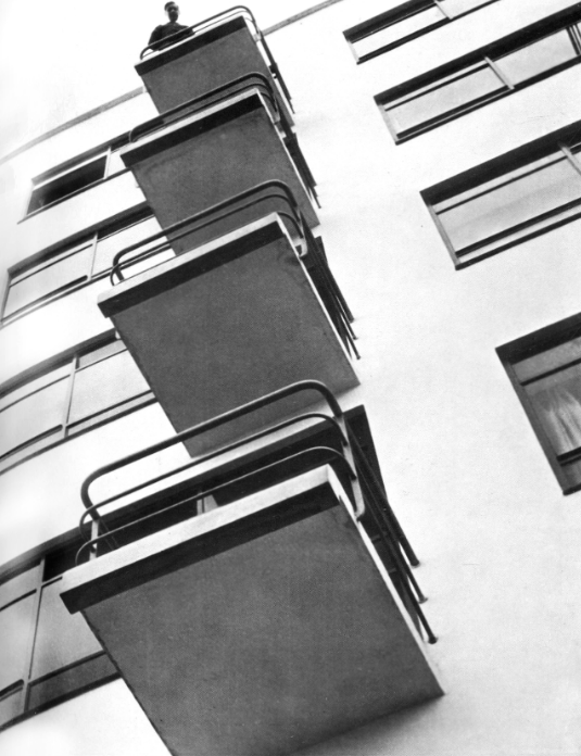
It is difficult to believe that the following two images were both taken on or around 1926 – on initial viewing they look about 50 years apart.
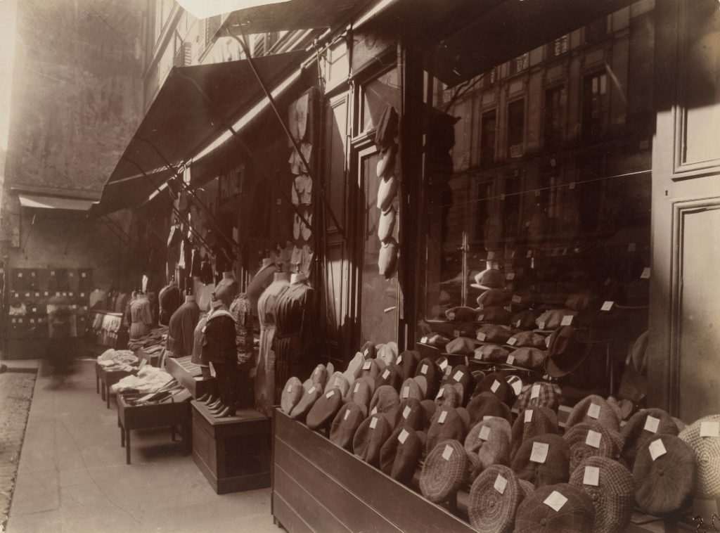
The lines in the Atget picture above guides you along the display of hats using perspective in a familiar way and as seen in many of his images. However there is more going on here. The supports of the dark awning and the shade they create guides us to the center of the image and the carefully framed vertical row of hats that are being illuminated by the shard of light in between the awnings. Having seen the same vertical central element used in the example work (Coin de quai Voltaire at rue de Nevres 1926 Exercise 1.3 Photography 1: Expressing your Vision p24) and it having been taken in the same year makes me believe this could not have been an accident but careful considered framing and also in this case the decisive moment when the sun is at the correct angle to hit the gap in the awnings and illuminate the hats. My gratitude to the design of the EYV course is worth mentioning here as I can tell it is already helping me to consider images more carefully and beginning to show me insights into work that I would previously have glossed over.
In the Moholy-Nagy image the sharp diagonal lines, abstract shapes, the use of dark and light (chiaroscuro – more learnings!) and the angle it’s taken from initially confuse; it only crystallises the viewers perception when you see the figure at the top immediately anchoring you into the real world (there are many examples where a figure is added to these architectural images – perhaps it’s something to do with man and the machine which was a common theme in the Bauhaus movement.)
It’s a world away from ‘Old Paris’. Perhaps that’s why Atget saw himself as a document maker and not a photographer – even his studio in Paris had a sign saying ‘Documents pour Artistes’ (“Eugène Atget: Photographs from the J. Paul Getty Museum Los Angeles, Calif.”)
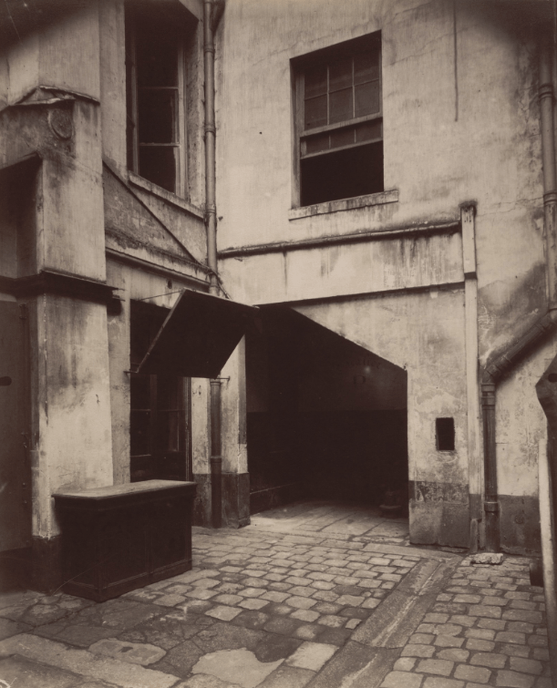
The use of line in this image from Atget would I think have pleased Moholy. Perspective is almost flattened with just the hint given by the cobbles, everything is in focus and geometry is everywhere. As a sidenote I was trying to work out why there was ‘vignetting’ on many Atget images or indeed why he was seemingly happy to have obvious visual ‘faults’ on his images. My understanding of victorian cameras needed a bit of work so after researching I found that in order to get the required perspective the bellows of the camera have to be adjusted which in some cases would mean encroaching on the light coming into the camera. (“(32) 55. View Camera Movements – YouTube,” https://www.youtube.com/watch?v=0JU-eHpk97Y n.d.)
Researching both Moholy and Atget was fascinating. I could see Atget in his late 50s and 60’s wielding an old heavy tripod and camera over his shoulder setting up outside a shop window and spending seemingly ages trying to find the right composition, making sure the lines lead somewhere. Contrasting that against the experimental Moholy nimbly shooting from above or below at the modern new Bauhaus building using a hand held camera.
My Images
All of these images (bar one) were taken on an afternoon in Cambridge. I continued with the use of ‘Automatic’ as in previous lessons. The lenses used were 28-75 f2.8 and 14-24 f2.8. In both cases the f2.8 was more of a hindrance in automatic as the camera often selected an aperture resulting in areas out of focus that needed to be sharp. I have kept editing and cropping to a minimum with minor adjustments and occasional conversions to B&W.
Creating a Sense of Depth
The first part of the brief…

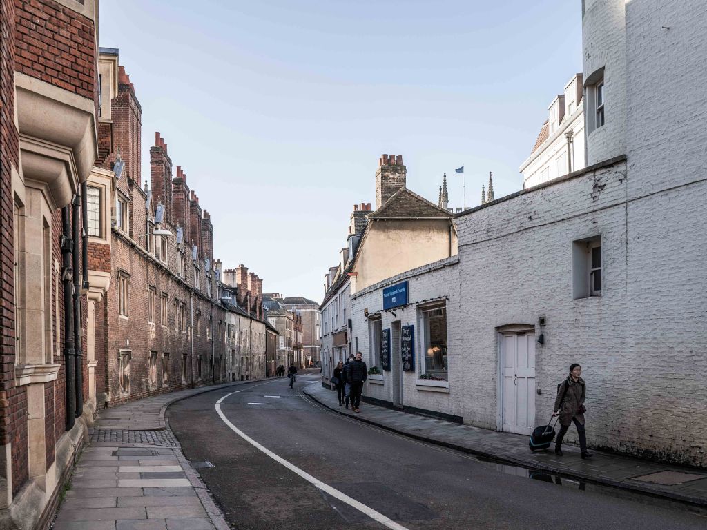
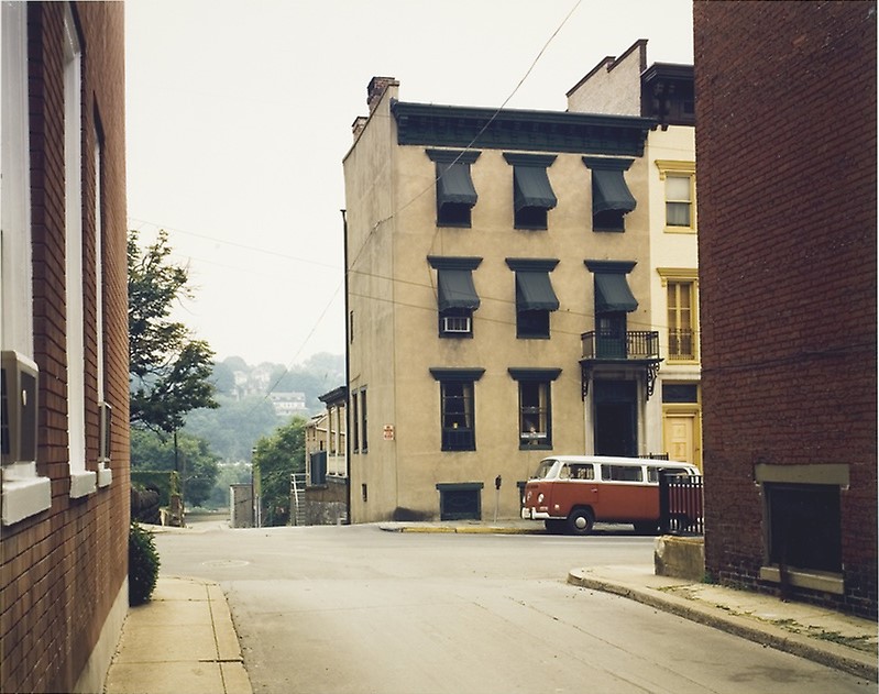
Cropped from a larger view of the street which I felt was too busy. The line leads you down into and along the street to the cyclist.
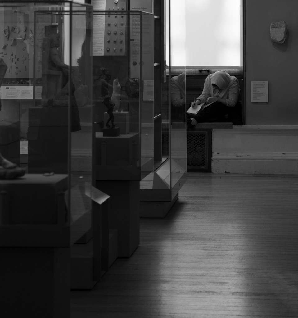
A subtle leading line from the display cases draws you towards the lady deep in thought.
A very obvious use of lines to create depth but I liked the way the ceiling work adds frames.
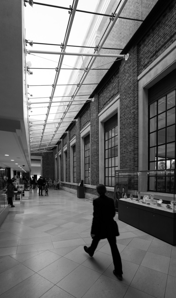
I waited here until someone walked through as I wanted to capture their stride which creates another line to add to the lights the windows leading you into the image. The ultra wide angle lens has helped emphasise and almost caricature the man’s legs and exaggerates the perspective.
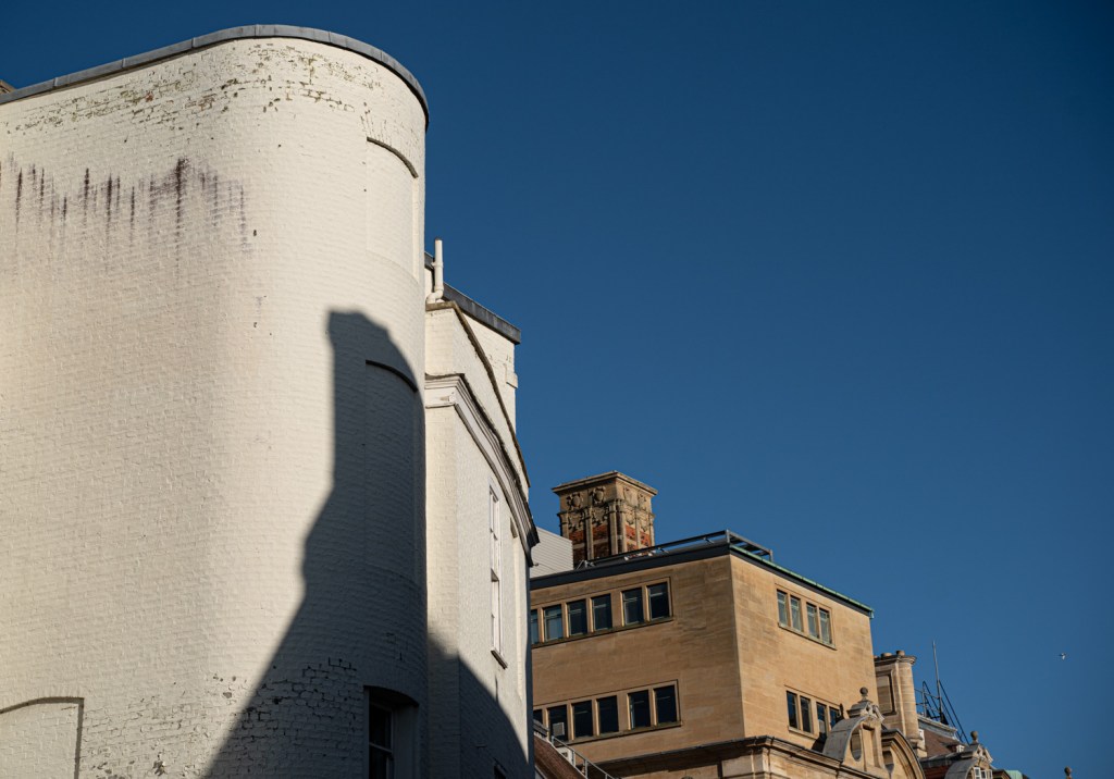
I was in two minds about this one. There are obvious diagonals which were more reminiscent of Moholy-Nagy than Atget but there is still a depth to the image though perhaps it is conjured from familiarity rather than visually represented. What do you think? The fact it required more thought on my behalf was reason enough to include it.
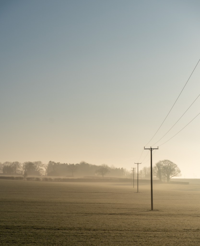
Had to have one landscape. Looking at the shutter speed I initially thought I may have had it set to S rather than AUTO by accident but I think it’s more likely to be early morning sun.
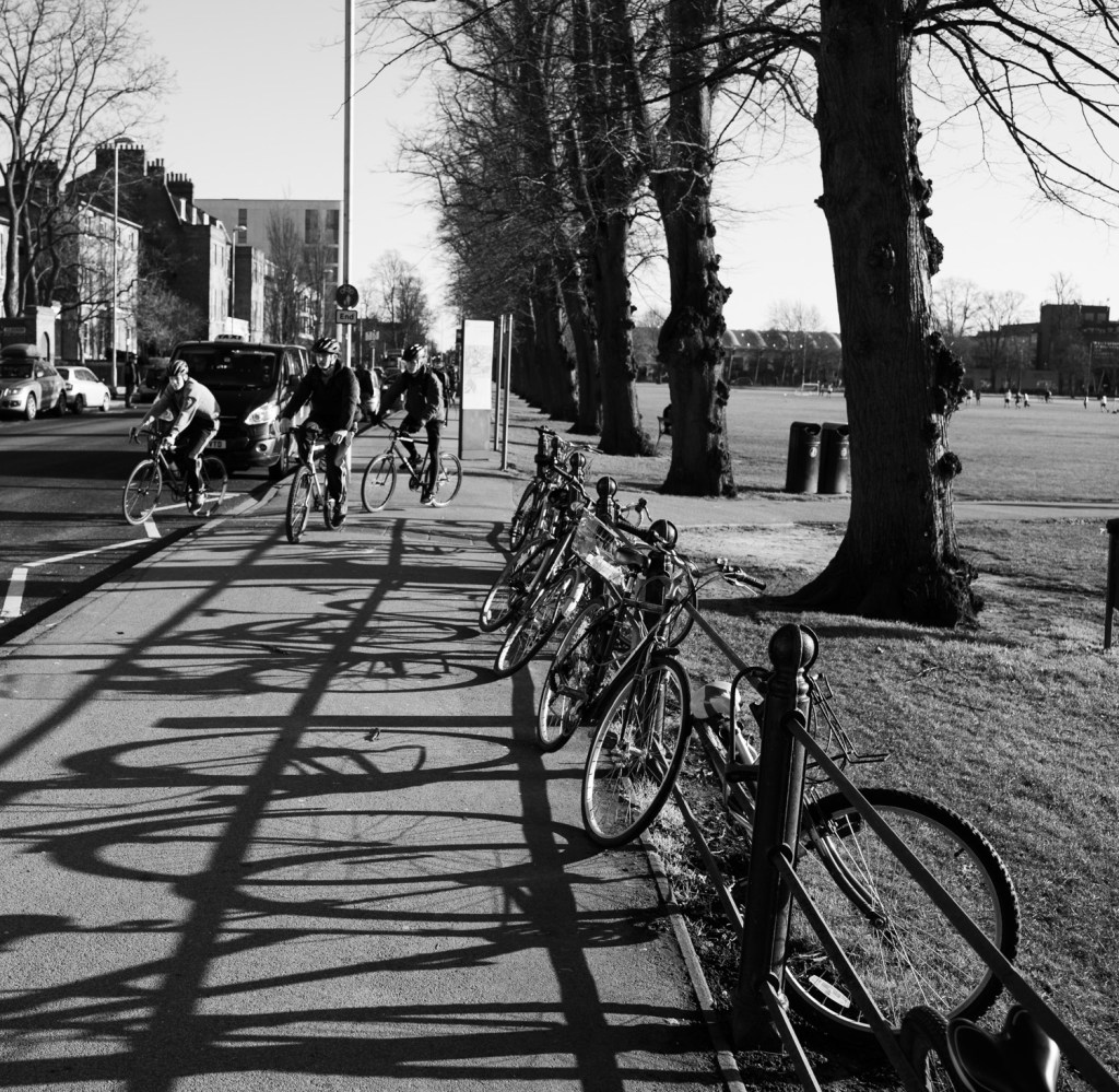
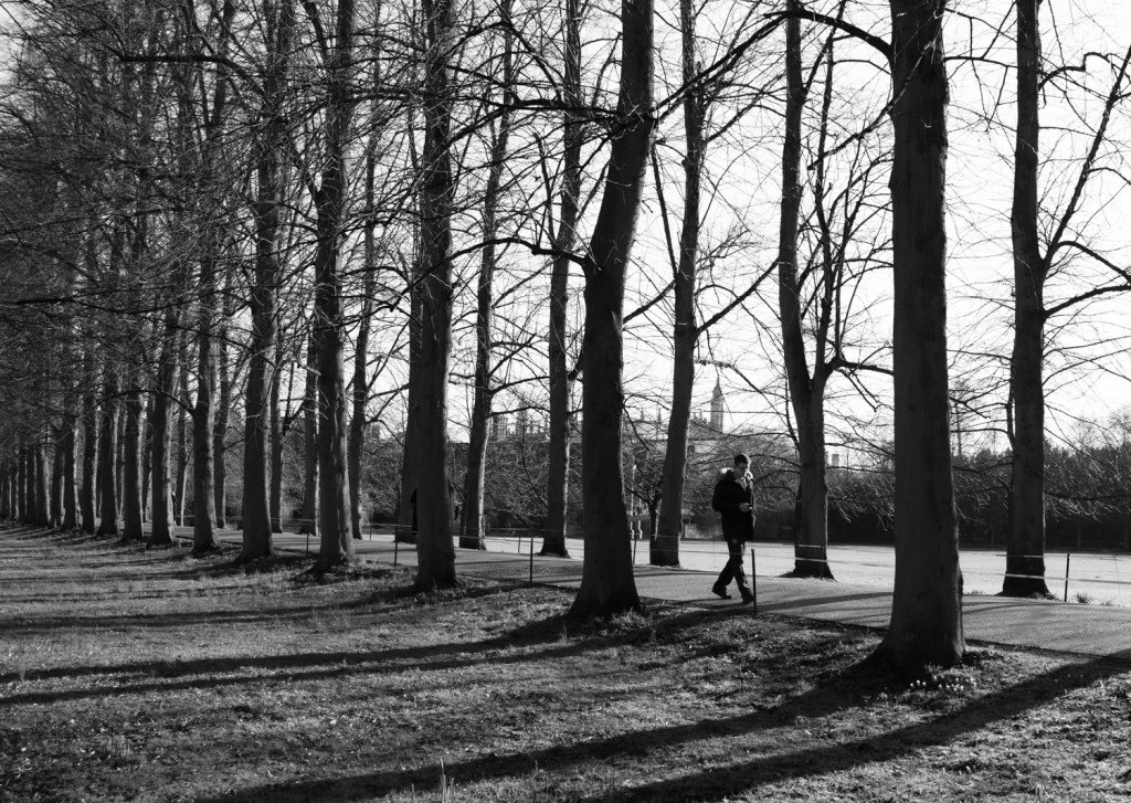
I don’t think this is a great shot but I liked the two sets of bikes and the shadows from the railings help to give depth and remind me of lanes that the bikes are racing down.
Flattening the pictorial space
The same street as the first image in the depth section (viewed from the other side) I’ve tried to use diagonal lines and an upwards angle to flatten the perspective and to divide it into three distinctive elements that lead you straight through the image rather than meandering along it.
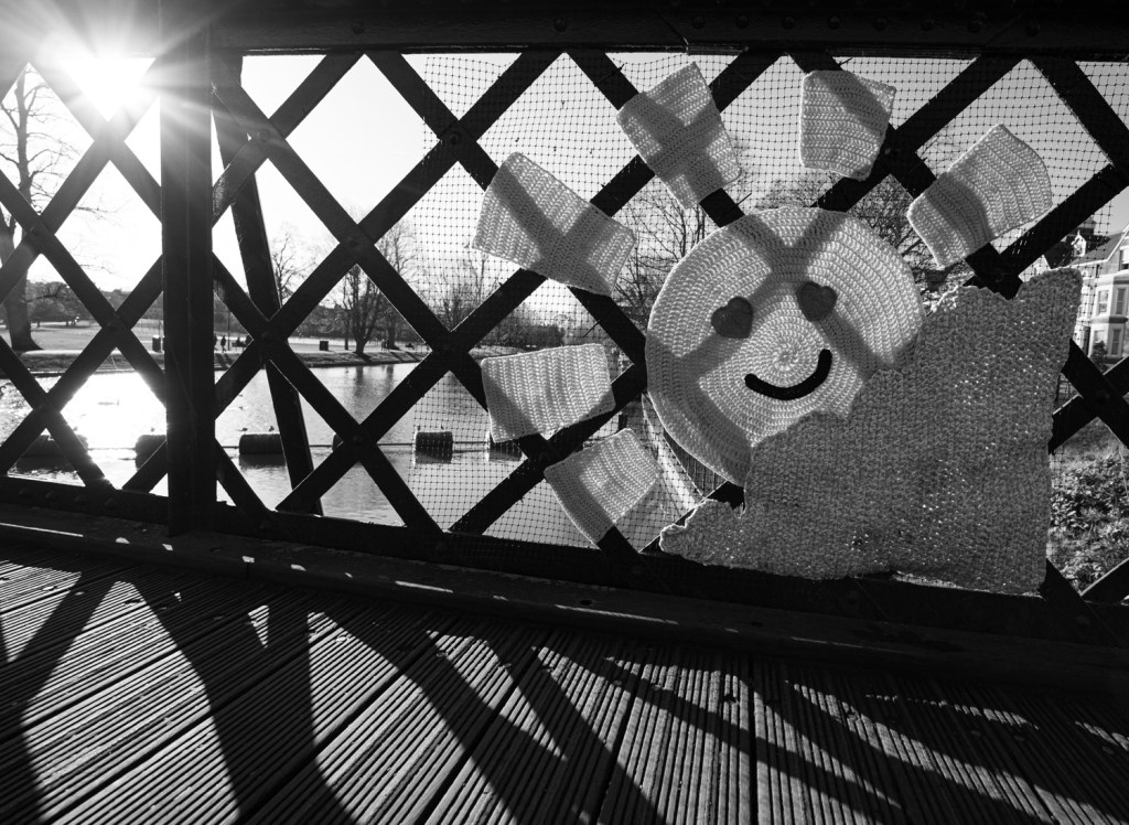
A useful reminder that changing the height of a shot makes a big difference. I knelt down to take this on a footbridge in Cambridge because someone had hung a bright crochet on it and I wanted the sun shining behind as a counterpoint and on framing the image noticed the fantastic lines and shadows being created. The sun helpfully bright enough to silhouette the bridge. Behind the main image you could argue there is some depth being created by the river banks.
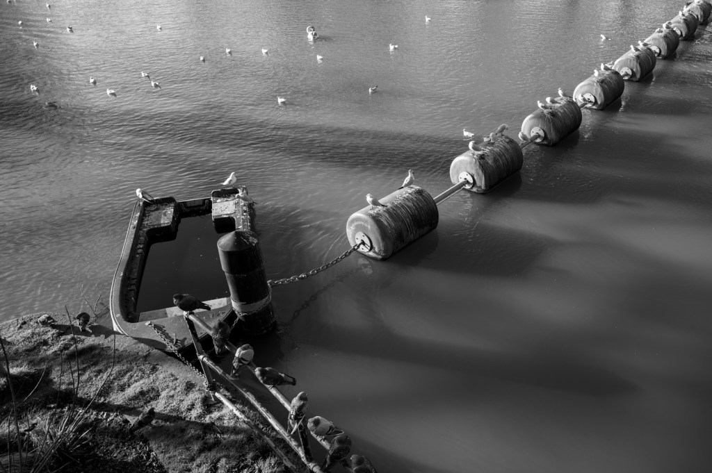
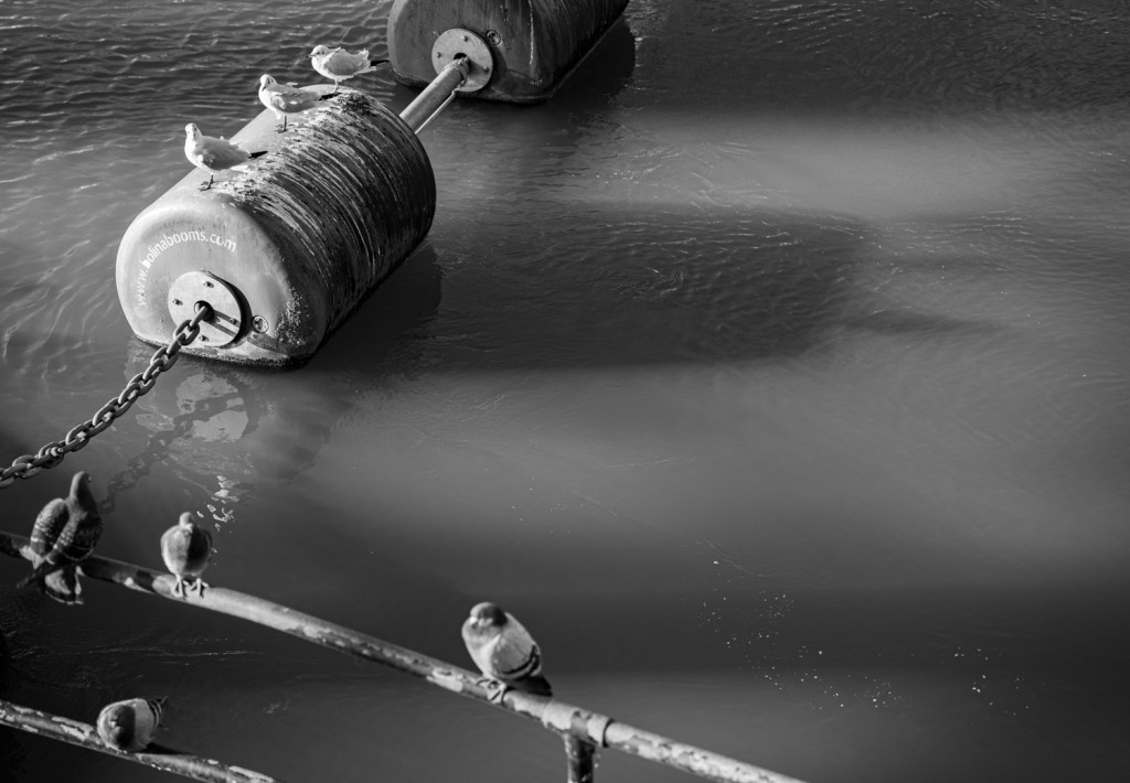
I struggled finding places with any real height to get the required flattened perspective of this lesson. I think the diagonal line and the shape of this is abstract enough to detract from any perspective from the buoys.(I wasn’t thinking outside of the box enough – I’ve since seen other OCA students who used close up work of smaller objects to fit the brief nicely – note reference failure!)
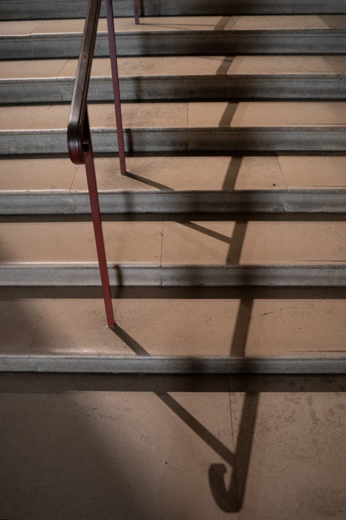
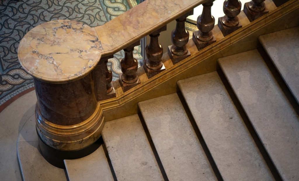
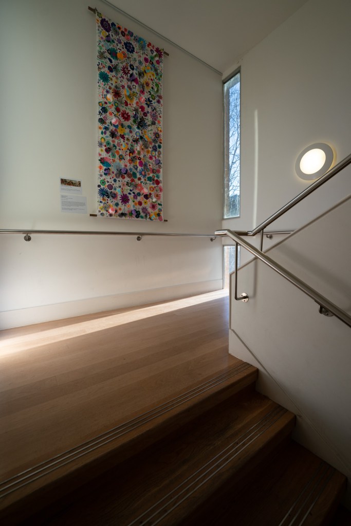
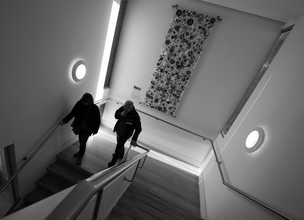
I think this is my favourite image from the lesson and proof that thinking about the brief and getting out and shooting can get the creativity flowing. I love the balance of the image and the subtle colour. From memory I focused on the handrail and the camera has gone for 2.8 as it’s in very low light hence iso 4000. This has softened the stairs a little which for me adds to the image.
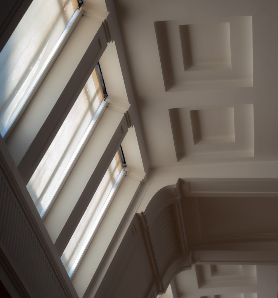
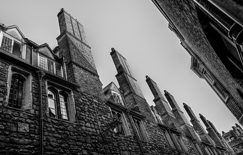
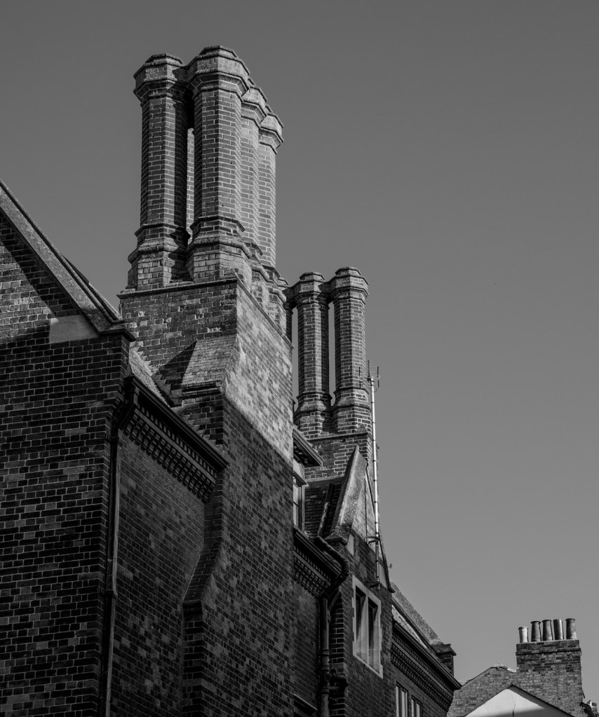
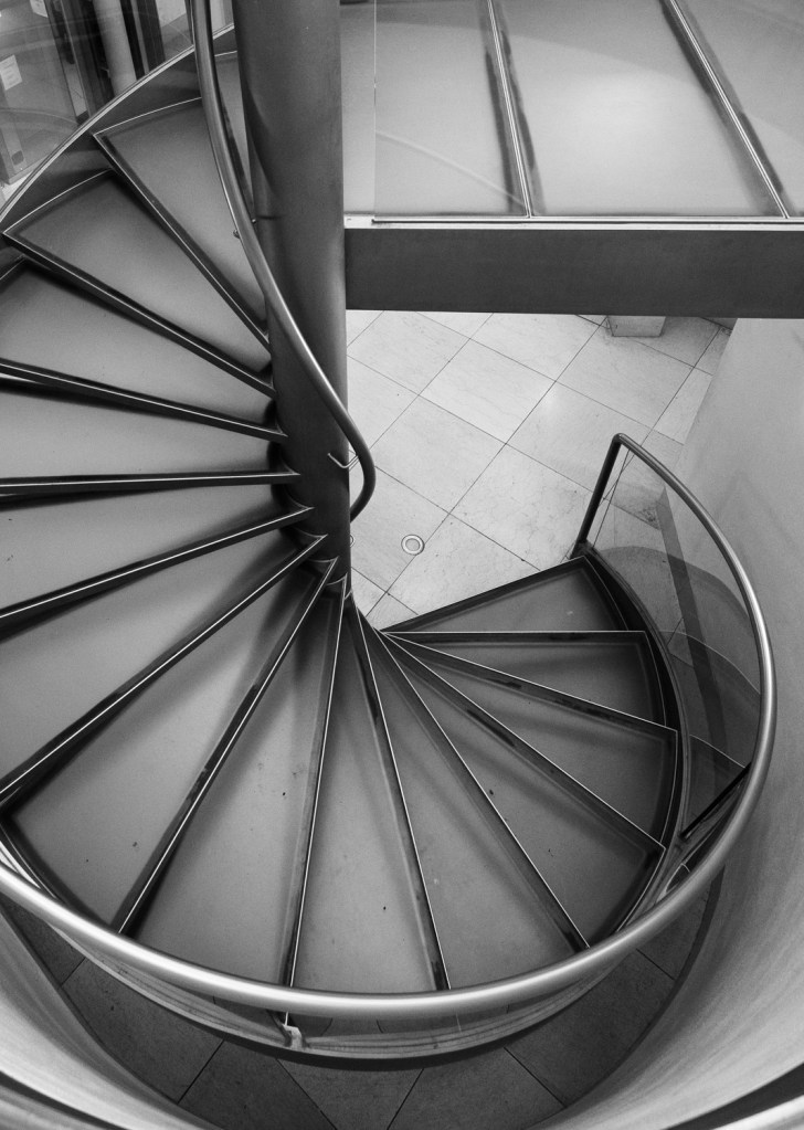
I picked this image because of the subtle diffused light and the geometry. Another image looking up at an angle.
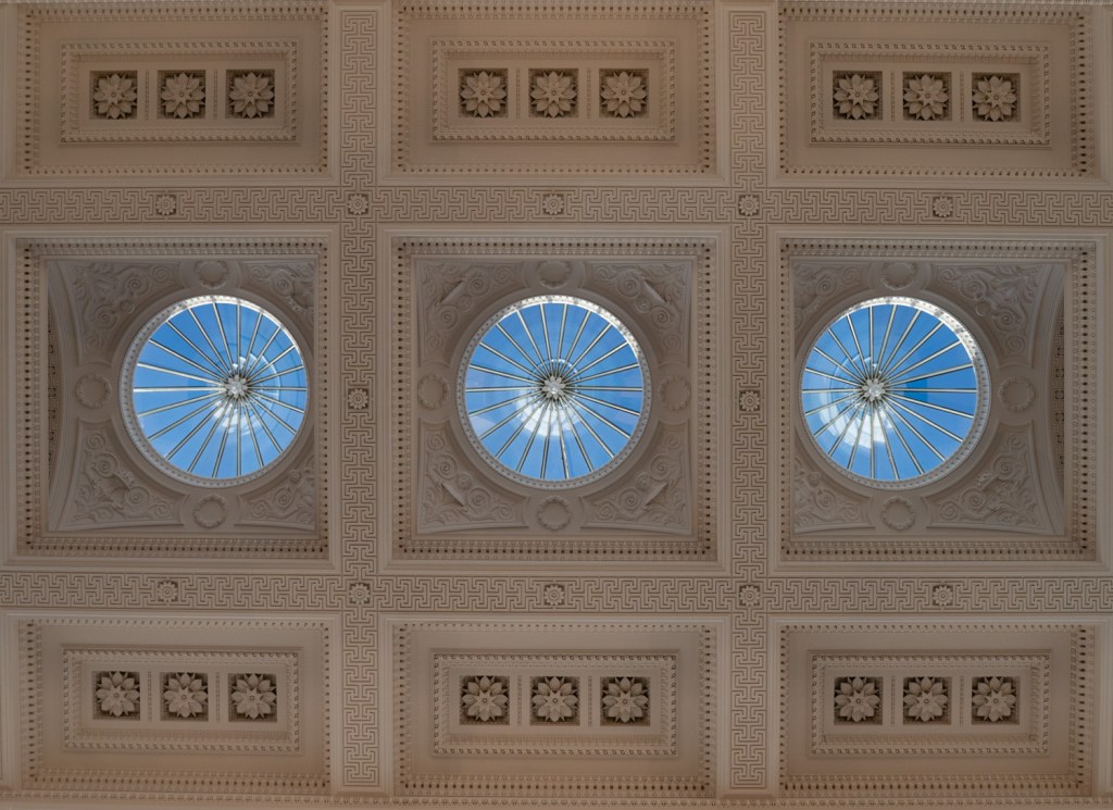
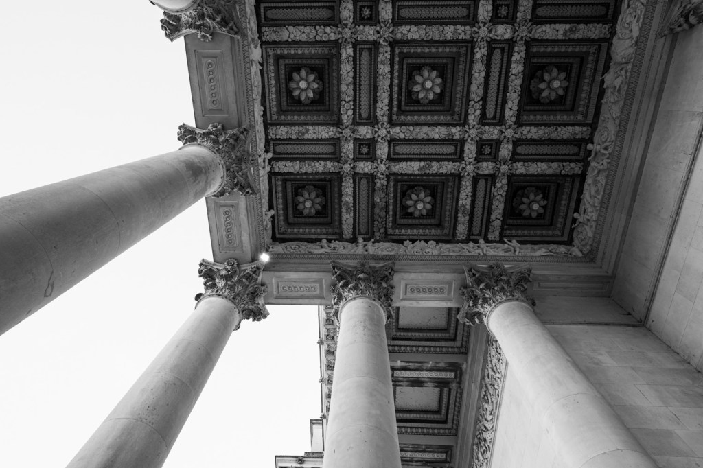
Neck ache. A very ornate ceiling but I loved the completely blue sky that punches holes through it – a winning noughts and crosses line.
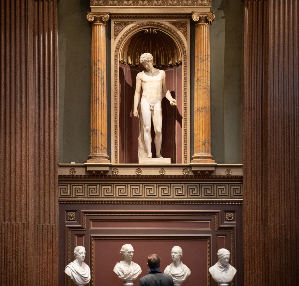
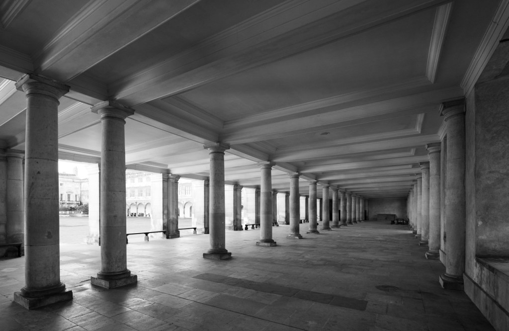
A bit of fun that’s debatable in following the brief. The human figures anchor you in the image. Without them it would look abstract and the pillars would lead you straight out which would work better as an example of a flattened perspective. I include it here as it is it does at least offer a talking point.
Other Images
These images were shortlisted but were left out because I felt they didn’t quite hit the brief or the depth of field was not quite right. In particular I struggled with f 2.8 on many images. Had I used my phone for some images I think the perspective would have been flattened further making them much more likely candidates.


Reflection
I was about to write my 1.4 exercise when I realised that I hadn’t written my reflection here. Usefully there is a great note on p27 of EYV which suggests ‘Looking back at some of your compositional exercises…..in the less conventionally successful shots there is a feeling of a cropped view rather than a transparent window to the world?’
This is a great way to reflect. I have a habit in my images of trying to make a ‘clean’ crop. I like to exclude what I determine to be intrusions on the edges of my images so that they ‘look’ better and don’t distract. I notice however that many photographers do not do this. I initially found it odd that photographers would do this – surely it’s poor framing? BUT I think now that maybe by making the edges clean it leaves the frame more evident and therefore you are less likely to spend time looking at the image.
A case in point from my first image of the cambridge street. I mentioned that it was cropped because it was ‘too busy’. Lets compare the versions.
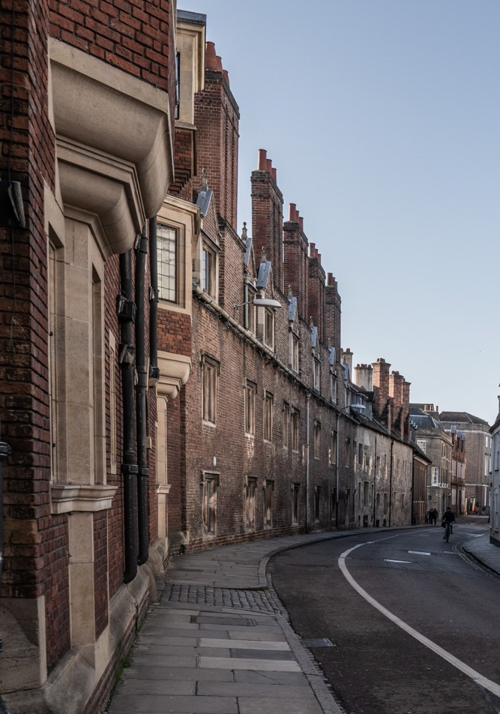
When I look at the first image I fly right down the road to the bike and boom that’s it. Nothing else to look at. It does fulfil the exercise in as much as it shows the depth but in terms of interest there is actually very little. If I look at uncropped version with fresh eyes I look at the lady with the suitcase, the door (did she just leave through there? why?), the shop, what is that white building? It might not be a great image but at least it forces you to examine the elements as you walk down the road into the picture.
I’ve also stumbled across a fascinating short video from Stephen Shore that has resonated with me probably more than anything else I’ve watched or read on photography on this course so far. One is to look at the relationship between elements of the composition and to recompose to try to make those elements work better or to show more elements harmoniously. Second is to try and include more for the eye to look at, force the viewer to study the image.
Look at his two images below and then watch the video and look again. If you haven’t seen these before (I hadn’t) I hope you get the same feeling of having your eyes opened as I did.
Thanks for reading.
Bibliography
(19) Talking about the Photographer Atget with Don Camera – YouTube, n.d. (19) Talking about the Photographer Atget with Don Camera – YouTube [WWW Document], n.d. URL https://www.youtube.com/watch?v=qLcAdF_CKIo (accessed 1.18.20b).
Rue de l’Hôtel de Ville, (1921) by Eugene Atget [WWW Document]. URL https://www.artgallery.nsw.gov.au/collection/works/76.2010/ (accessed 1.29.20).
Eugène Atget, 2019. . Wikipedia.
Eugène Atget: Photographs from the J. Paul Getty Museum – Eugène Atget, Associate Curator of Photographs Gordon Baldwin, J. Paul Getty museum (Los Angeles, Calif.)., Gordon Baldwin, J. Paul Getty Museum – Google Books, n.d. Eugène Atget: Photographs from the J. Paul Getty Museum – Eugène Atget, Associate Curator of Photographs Gordon Baldwin, J. Paul Getty museum (Los Angeles, Calif.)., Gordon Baldwin, J. Paul Getty Museum – Google Books [WWW Document], n.d. URL https://books.google.co.uk/books?id=PxKaEm6CgC8C&pg=PA8&lpg=PA8&dq=atget+document+maker&source=bl&ots=wrW1yGkU77&sig=ACfU3U1klBYM3N4-klKmzfo3GNKuoZLS8g&hl=en&sa=X&ved=2ahUKEwiiuKDxz7XnAhVGdcAKHSA3CdwQ6AEwAXoECAoQAQ#v=onepage&q=atget%20document%20maker&f=false (accessed 2.3.20b).
Eugène Atget. Vieille Cour, 22 rue Saint-Sauveur. 1914 | MoMA, n.d. Eugène Atget. Vieille Cour, 22 rue Saint-Sauveur. 1914 | MoMA [WWW Document], n.d. URL https://www.moma.org/collection/works/40262 (accessed 2.3.20b). Snapshot, n.d.
(19) László Moholy-Nagy: Proto-Conceptual Artist – YouTube, n.d. (19) László Moholy-Nagy: Proto-Conceptual Artist – YouTube [WWW Document], n.d. URL https://www.youtube.com/watch?v=l7iKw2Qtr6w (accessed 1.18.20b).
Architecture, art and design – 100 years of the Bauhaus (1/3) | DW Documentary, n.d. László Moholy-Nagy: Proto-Conceptual Artist, n.d. László Moholy-Nagy [WWW Document], n.d. . THEY NEW YORK. URL https://theynewyork.com/blogs/journal/laszlo-moholy-nagy (accessed 1.29.20b).
Moholy-Nagy and Photographic Processes, n.d. Moholy-Nagy: Exhibition Overview at the Guggenheim, n.d. MOHOLY-NAGY FOUNDATION | Photo Album, n.d. MOHOLY-NAGY FOUNDATION | Photo Album [WWW Document], n.d. URL https://moholy-nagy.org/photo-album/ (accessed 1.21.20b).
MOHOLY-NAGY FOUNDATION | START, n.d. MOHOLY-NAGY FOUNDATION | START, n.d. MOHOLY-NAGY FOUNDATION | START [WWW Document], n.d. URL https://moholy-nagy.org/ (accessed 1.29.20c).
MOHOLY-NAGY FOUNDATION | START [WWW Document], n.d. URL https://moholy-nagy.org/ (accessed 1.21.20d). Snapshot, n.d.
(24) John Berger: Understanding a Photograph – YouTube, n.d. (24) John Berger: Understanding a Photograph – YouTube [WWW Document], n.d. URL https://www.youtube.com/watch?v=L1h4KdSSr2Q&list=PLJMP195TR7si5VvxpBJdqvG20-aiz7MXS&index=3&t=0s (accessed 1.22.20b).
berger_understanding_a_photograph.pdf, n.d. John Berger / Ways of Seeing , Episode 1 (1972), n.d. John Berger on Ways of Seeing, being an artist, and Marxism (2011) – Newsnight archives, n.d. Perspective makes the eye the center of the visible world 1:42 All that changed with the invention of the camera., n.d.
Laszlo Moholy-Nagy (Phaidon 55’s): Amazon.co.uk: Laszlo Moholy-Nagy: 9780714840185: Books [WWW Document], n.d. URL https://www.amazon.co.uk/Laszlo-Moholy-Nagy-Phaidon-55s/dp/0714840181/ref=sr_1_1?keywords=laszlo+phaidon+55&qid=1580749398&s=books&sr=1-1 (accessed 2.3.20).
Eugène Atget (PHOTO PHAIDON 55): Amazon.co.uk: Gerry Badger, Anne Béchard-Léauté: 9780714891415: Books [WWW Document], n.d. URL https://www.amazon.co.uk/Eug%C3%A8ne-Atget-Gerry-Badger/dp/071489141X (accessed 2.3.20).
Badger, G. and Atget, E. (2002). Eugene Atget. 1st ed. London: Phaidon.
Fiedler, J. (2001). Laszlo Moholy-Nagy. London: Phaidon Press.
(42) Stephen Shore | HOW TO SEE the photographer with Stephen Shore – YouTube [WWW Document], n.d. URL https://www.youtube.com/watch?v=T029CTSO0IE (accessed 2.12.20).
Stephen Shore | MoMA [WWW Document], n.d. URL https://www.moma.org/artists/5409#works (accessed 2.12.20).
Eugène Atget. Rue Mouffetard. 1926 (s.d.) At: https://www.moma.org/collection/works/40494 (Accessed 20/01/2021).
Design is fine. History is mine (s.d.) At: https://www.design-is-fine.org/post/45628427192/l%C3%A1szl%C3%B3-moholy-nagy-bauhaus-balconies-dessau (Accessed 20/01/2021).
Eugène Atget. Vieille Cour, 22 rue Saint-Sauveur. 1914 (s.d.) At: https://www.moma.org/collection/works/40262 (Accessed 20/01/2021).
Edition, S. (s.d.) ‘LEARNING ON SCREEN GUIDELINES FOR REFERENCING MOVING IMAGE AND SOUND’ At: http://bufvc.ac.uk/wp-content/media/2018/01/Learning-on-Screen-AV-Citation-2017-ONLINE.pdf
Stephen Shore (s.d.) At: https://www.moma.org/audio/playlist/45/709 (Accessed 20/01/2021).
Stephen Shore. Church and 2nd Streets, Easton, Pennsylvania, June 20, 1974. 1974 (s.d.) At: https://www.moma.org/collection/works/101463 (Accessed 20/01/2021).

A really well-executed exercise – I quite enjoyed reading through it – I am quite torn between the cropped and uncropped version of your street. One looks sharp and other more inviting. Love both, thanks for sharing the video of Stephen Shore. Best wishes.
LikeLike